I am the same teapot mentioned in the title: I didn't go to art school, I didn't study color. But I turned out to be a meticulous teapot, and until I independently figured out the basics of this science, I did not start writing an article.
It all started with the fact that I learned to be a stylist-image maker. During the training (and with different teachers) the topic constantly pops up color harmony... But all the time the information was not structured, or poorly structured. The teachers suggested just memorizing color combinations and proportions, but this approach is not at all close to me - if there are objective patterns, algorithms, then I will try to study and understand them. Only in this case can I apply this knowledge in real life.
Before I took up this job, I honestly shoveled the Internet. Bloggers only quote the authors of books, without trying to explain to the layman what's what. (I did it myself here).
I studied color science from Johannes Itten's book The Art of Color. The book has only 95 pages, but I sat on each one for several days - the author's reasoning is so deep and multi-dimensional. Johannes Itten is an artist and major color researcher of the 20th century. It is he who is the creator of the color wheel - the main tool for color design. In general, I highly recommend purchasing this book in your home library - it will be useful for you and your children.
PHYSICS OF COLOR
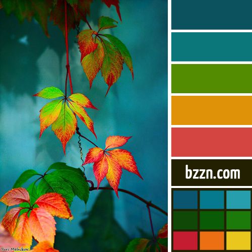
Remember from school: "Every hunter wants to know where the pheasant is sitting?" With this funny phrase, we were taught the sequence of colors in the rainbow. And why exactly this sequence of these particular colors was not particularly explained to anyone.
We will find explanations by reading about the experiment of Sir Isaac Newton, which he spent in 1676. The venerable scientist, using a triangular prism, decomposed sunlight into a spectrum and received this color sequence. 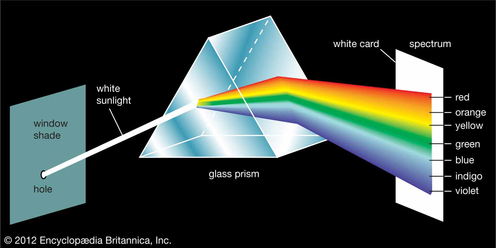
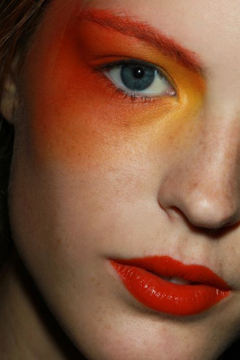
Then he did many other experiments with a prism and sunlight. We are interested in the experience of obtaining additional colors. If with the help of a prism we collect all the colors except green, then we will see red on the screen. And if you collect everything except purple, we get yellow. But if we combine red with green, and purple with yellow, the result is a sunny color. These color pairs are called complementary. This is very important to know if you want to deal with color harmony.
COLOR CIRCLE
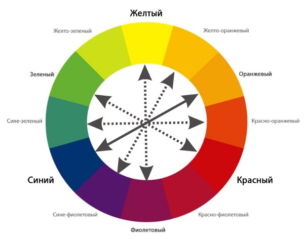
The above information is, of course, useful, but it does not allow you to simply structure the provisions of the color scheme and clearly demonstrate them. Researcher Johannes Itten studied color for many years before deriving the formula for his famous color wheel. From now on, I will constantly draw your attention to the color wheel, because he acted as the very visual color designer who simply explains the principles of color harmony.
It is very important to understand how he composed this circle. Below I am writing an algorithm, read it carefully.
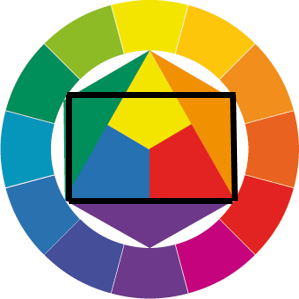
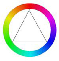
1. Itten took three primary colors: yellow, red and blue, and evenly painted an equilateral triangle with these colors.
Skeptics will ask: "Why did he take these colors as a basis?" Great question, thanks! He chose them because anyone with normal vision can identify, for example, yellow, without a red or blue tint. It's the same with red and blue. But with other flowers, the whistle begins. 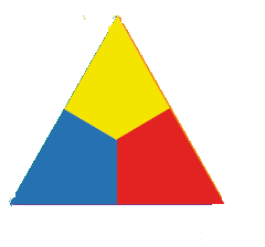
2. Then he began to mix colors with each other: yellow with red, red with blue, blue with yellow. The result is orange, purple and green, respectively. Soooo, to fit these colors into the model, Itten drew a circle around the triangle with a compass and built a regular hexagon on its basis. He filled in the resulting empty triangles with new colors. 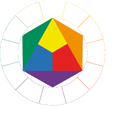
3. Around this circle, he drew another, larger, and divided it into 12 identical sectors. He filled six sectors, according to logic. Look at the picture: the vertices of the triangles clearly indicate what color each sector should be filled with. 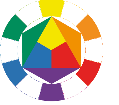
4. To fill the remaining 6 sectors, Itten began to mix neighboring colors: yellow with orange, orange with red, red with purple, etc. With the resulting colors, he filled in the empty sectors.
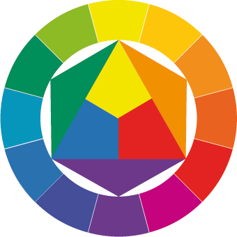
So, if we look at the resulting color wheel, we will see that the complementary colors (these are the ones that form sunlight in tandem, remember?) Are opposite each other. And the 2 main tricolors: red-blue-yellow and green-orange-violet form equilateral triangles (take a closer look, they are located exactly in 3 sectors!).
Congratulations, if you understand how the color wheel works, then it will not be difficult for you to figure out how to use it to determine harmonious color combinations.
COLOR HARMONY
Usually, when you ask people what color combinations are harmonious, they call either mixes of similar colors (purple-blue-blue) or pastel colors (pink-blue-beige).
Itten studied for many years how people relate to flowers and concluded that for different people the phrase "color harmony" means completely different color combinations. (By the way, he also deduced some regularities here, he is also the founders of the theory of color typing "Seasons", but today is not about that). Such results did not suit him at all, he tried to find some objective laws according to which absolutely all people with normal vision would perceive some color combinations as harmonious.
And he found them! (Not without the help of Goethe, Gehrig, Rumford and Ostwald, of course, but this, as you understand, is also not in this article).
You and I, that is, people, are so arranged that we love order in everything. And the statement "Harmony \u003d order" is true.
I will tell you here about several experiments that led to a very important conclusion about harmony, which I will write about below. (Just while you are not ready for it yet).
Experience number 1:Look at the red square on a white background. Now close your eyes. What color will be before your eyes?
That's right, green. When I was little, my mother often trained my eyes with the help of this exercise: I had to look for 15 seconds at a light bulb with a black circle drawn on it. Then I had to look at the wall. And I saw what circle on the wallpaper? Correctly white. This phenomenon can be called a consistent contrast. The eye needs a complementary color to achieve balance. Cool, yeah?
Experience number 2: Look at the gray square on a yellow background. Look for a long time, 30 seconds. 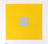
Don't you think it's not just gray?
Now look at this same square on a green background. 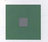
What shade does it have, m?
If you did everything correctly and you have normal vision, then, accordingly, you saw purple in the first picture and red in the second. E this phenomenon is called simultaneous contrast. Pure colors tend to color other chromatic colors with their complementary color!
I will not force you to carry out any more experiments, but I will tell you about the amazing results of the experiments of obsessed physiologists. In general, we were looking for a color, on the perception of which we spend exactly as much energy as is required to restore them. And it turned out to be ... average grey colour! It is he who gives a sense of balance, which is so necessary for our vision. Itten did a lot of experiments and found out that if you mix additional colors (on paper), you get the same medium gray. It will also work if you mix red with blue and yellow. In addition, if we mix other colors, which are formed by mixing red, blue and yellow in the proper proportions, then we also get the same average color.
Friends, congratulations! We got to the last paragraph!
COLOR HARMONY
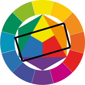
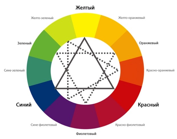
So, on the basis of all the reasoning and inferences made in the previous paragraph, Itten concluded that all colors that are connected in the color wheel using equilateral and isosceles triangles, squares and rectangles form harmonious color combinations.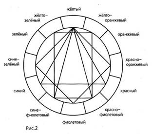
Actually, that's all. I have a real color wheel, and when I need to figure out what to combine it with, I begin to speculatively draw geometric shapes with apex in the desired color. But you can also use the picture on your phone.
Let's look at a specific example.
EXAMPLE.
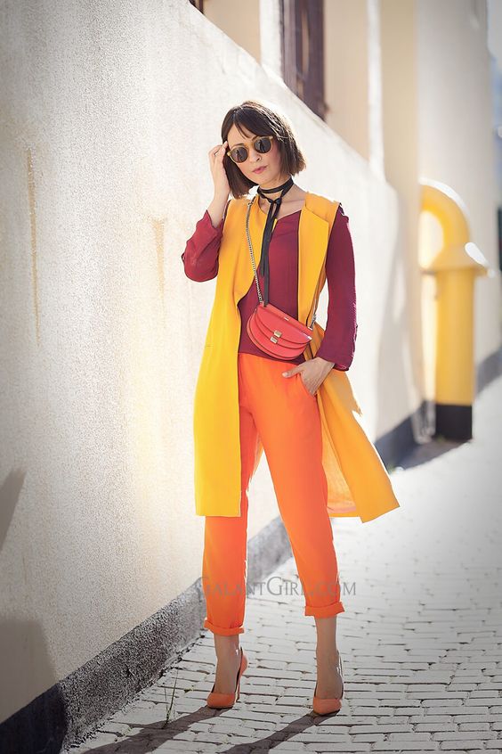
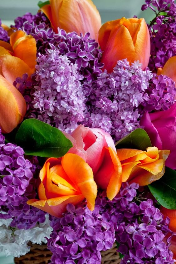
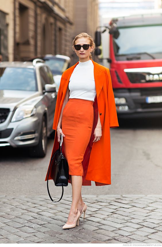
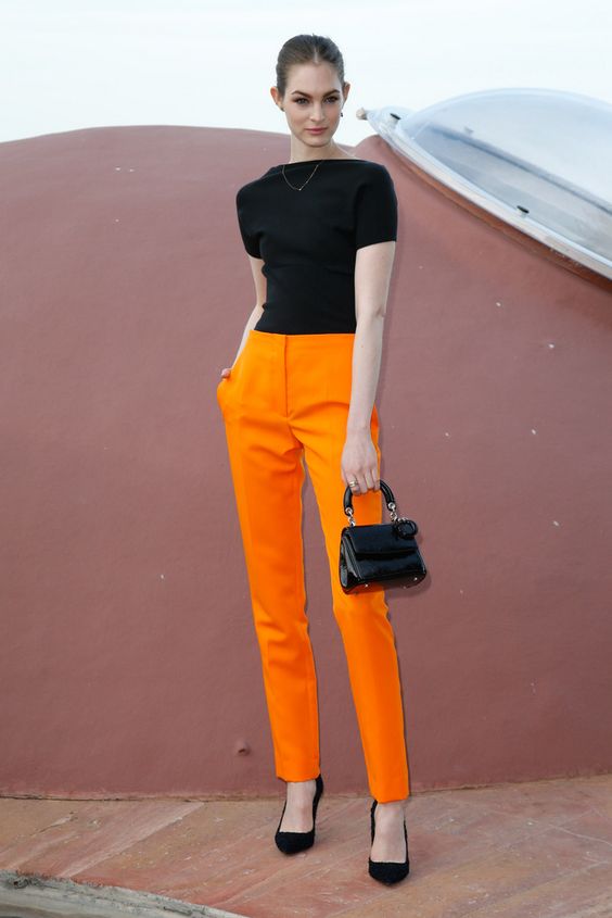
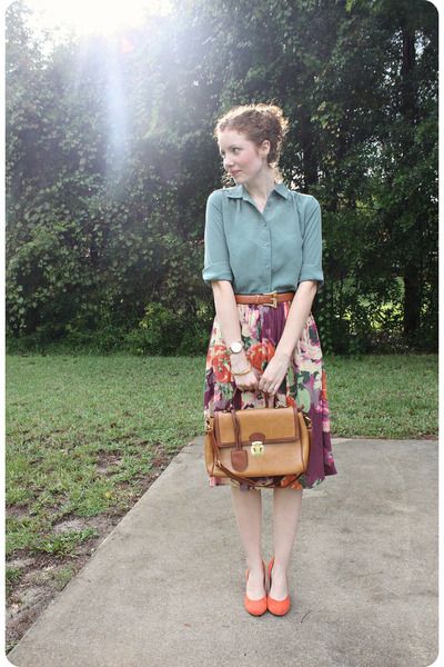
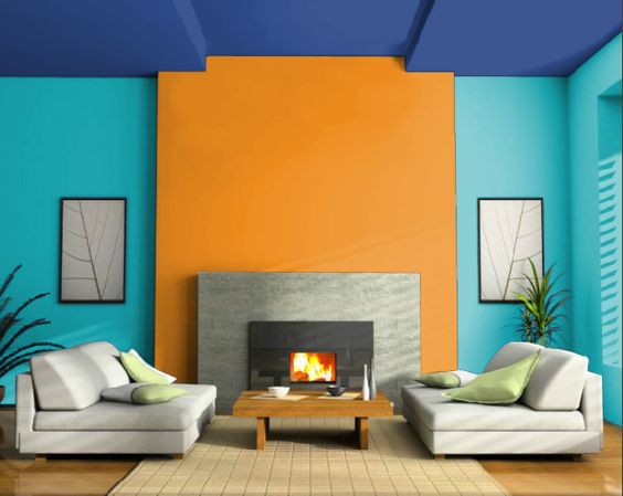
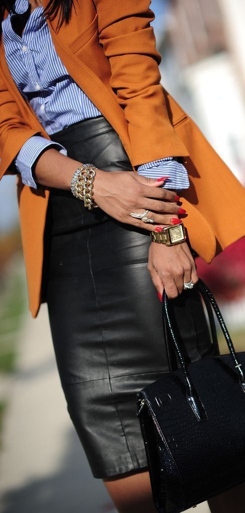
I have a coat orange... What are the possible color combinations?
1). A combination of two colors.
We take from the color wheel the color diametrically opposite to orange. it turns out blue. 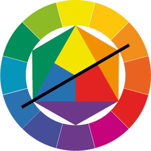

2) A combination of three colors.There are various options here :
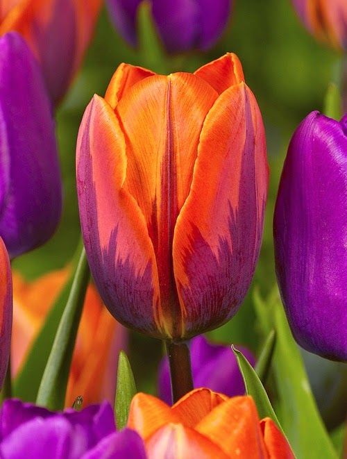
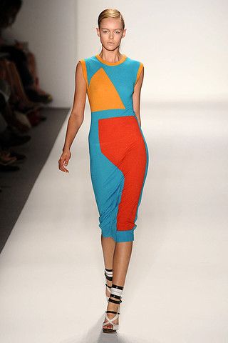
and. Equilateral triangle: Orange, green and purple: 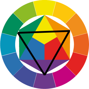

b. Isosceles triangle: yellow, orange and red. 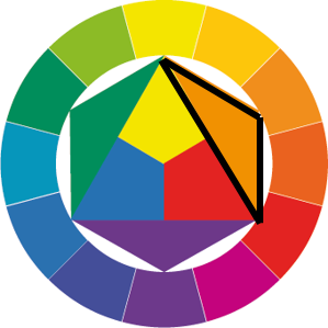
from. Another isosceles triangle: orange, yellow-green and red-purple. 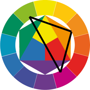
d. The next isosceles triangle: orange, blue-violet, blue-green. 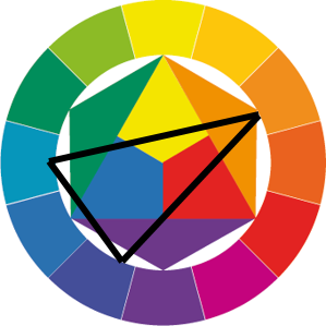

e. So, the smallest isosceles triangle remained, with neighboring colors: orange, yellow-orange, red-orange. 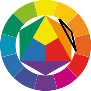
3). Combination of 4 colors.
and. The square is composed of orange, blue, red-violet and yellow-green. 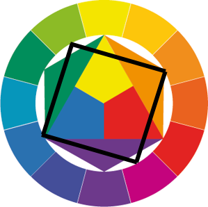
 .
.
b. The rectangle will be orange, red, green and blue.
c. You can also make 2 rectangles: orange, orange-yellow, blue, blue-violet and orange, orange-red, blue and blue-green. I will not even try and select pictures, because the combinations will turn out to be similar for the eye of an ordinary person. 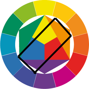
Well, something like that, comrades. As you can see, color is also possible on "you", without the help of the Internet. Personally, I now always have confidence when I create an interior or costume ensemble in different colors.
Of course, this article does not cover everything about color. In it, I only touched on the topic of color consonances. But we'll talk about the characteristics of color, about achromats, about color contrasts and the color ball sometime later.
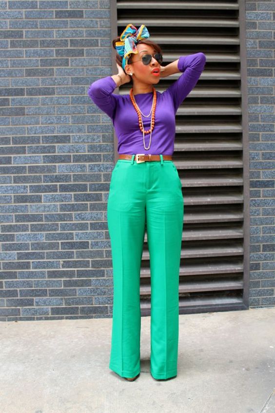
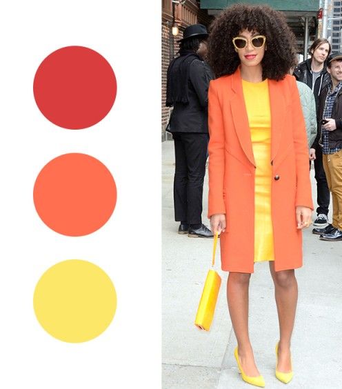
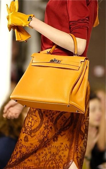
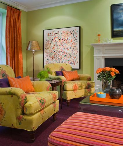
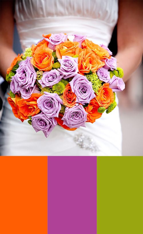
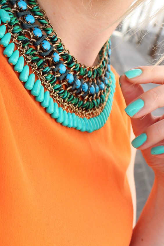
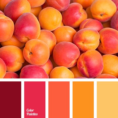
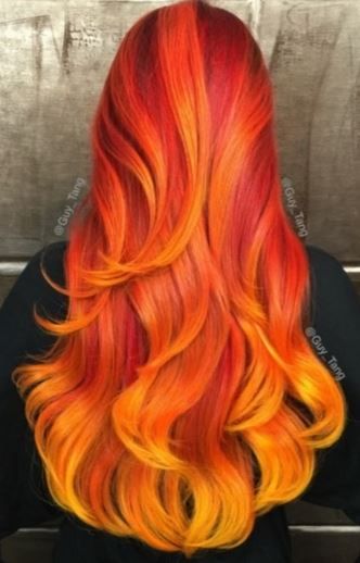
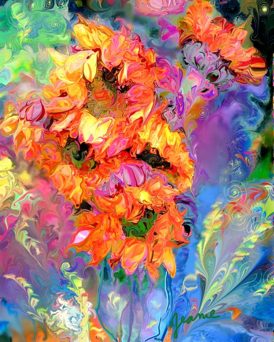
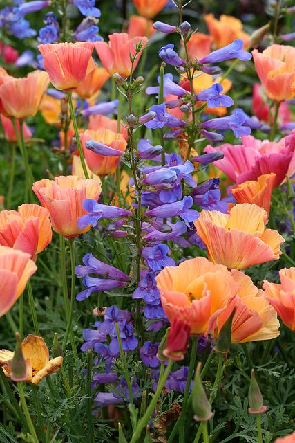
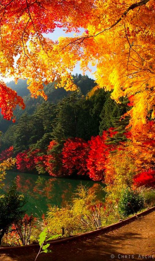
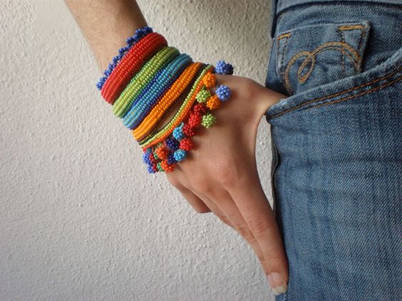
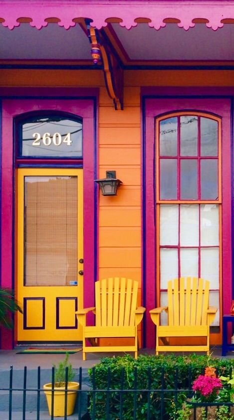
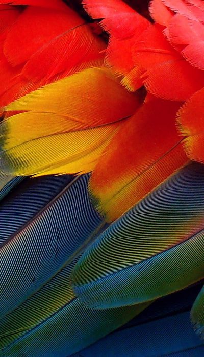
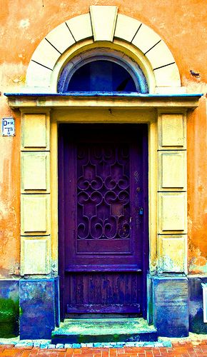
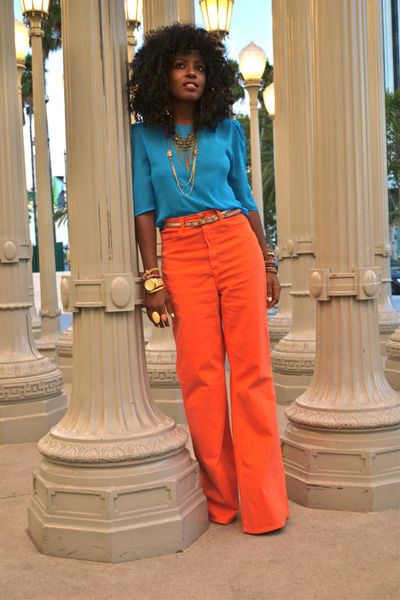
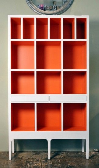
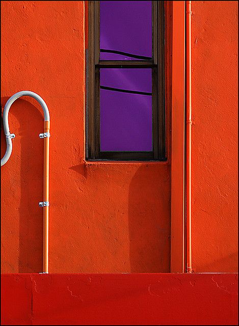
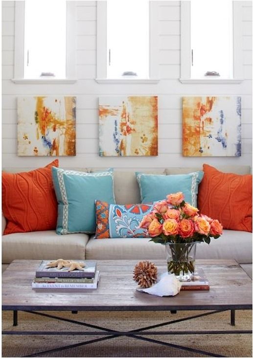
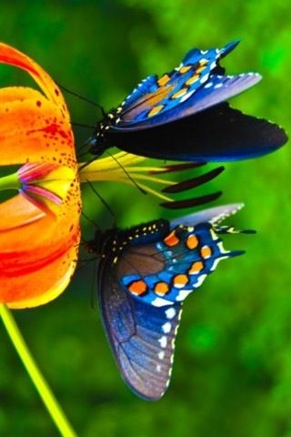
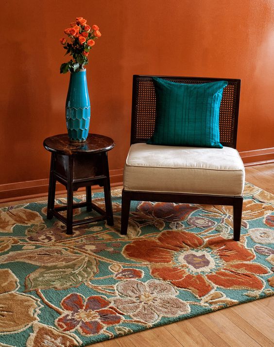
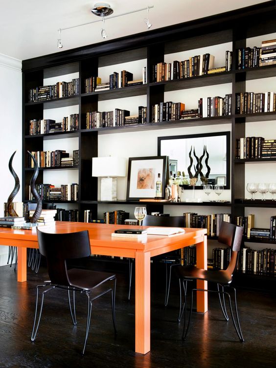
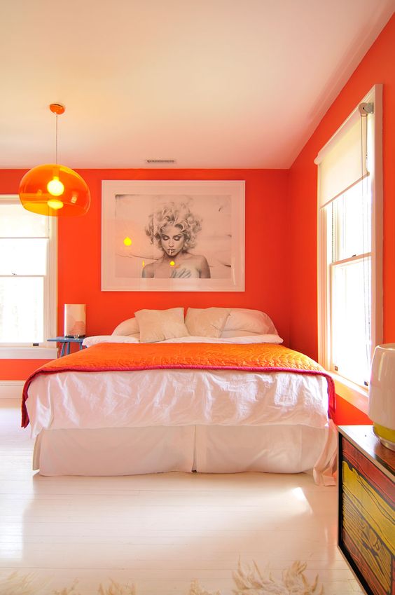
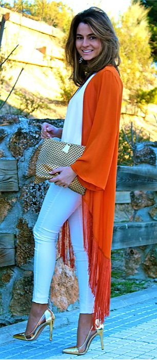
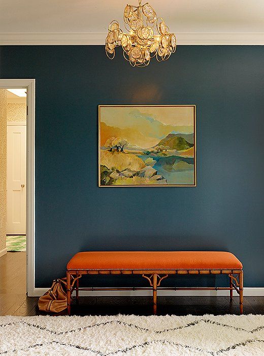
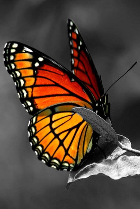
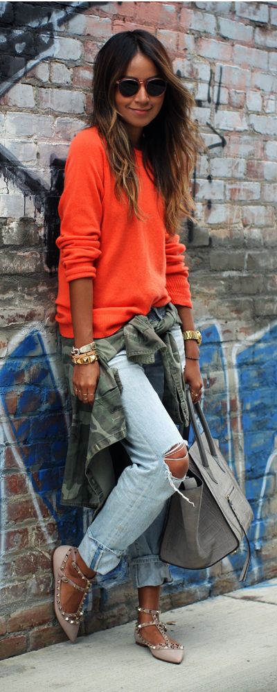
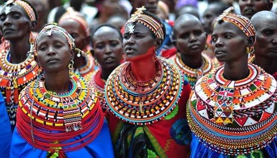
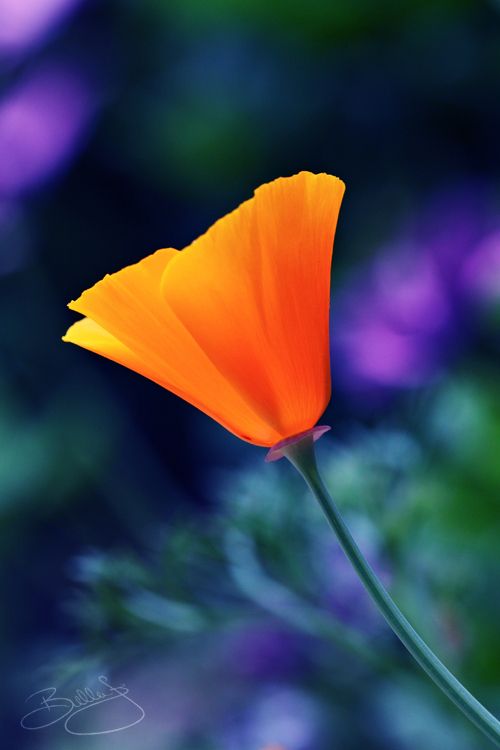
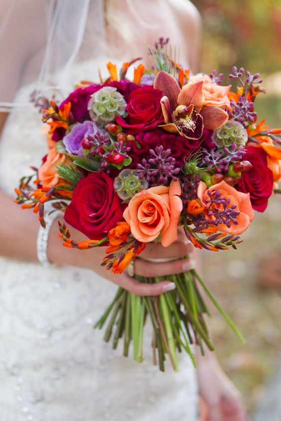
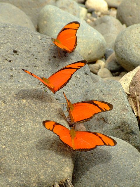
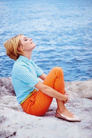
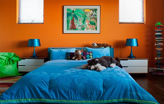
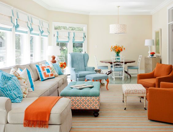
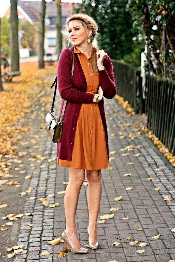
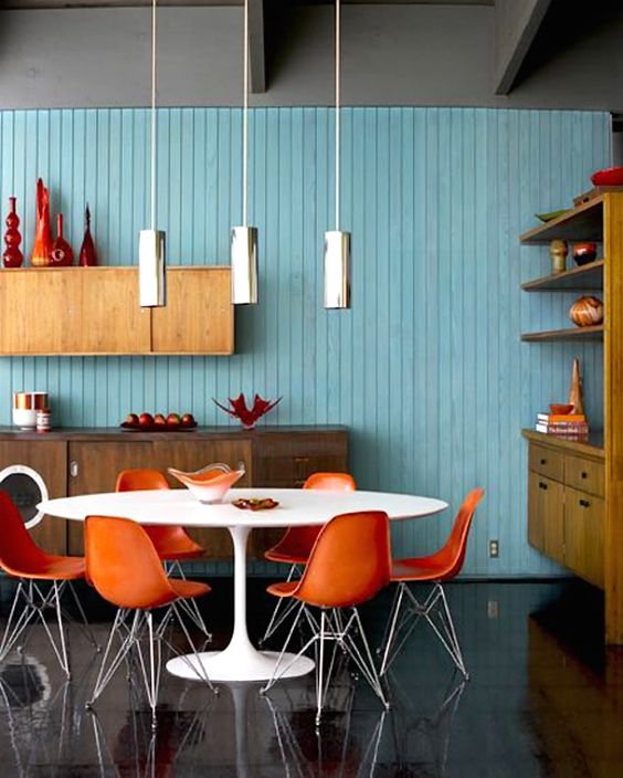
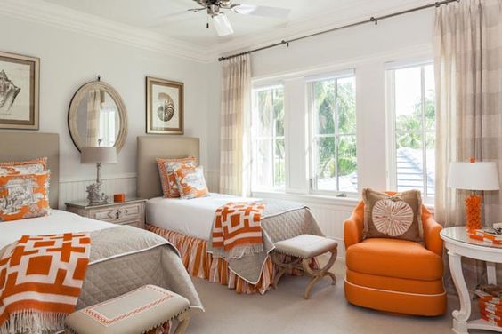
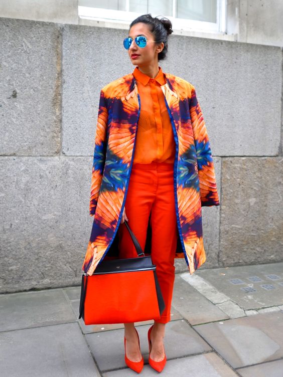
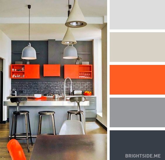
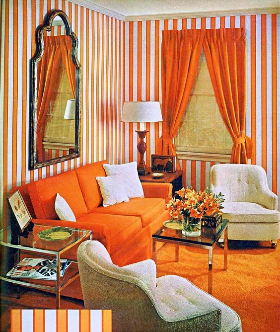
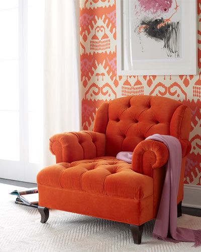
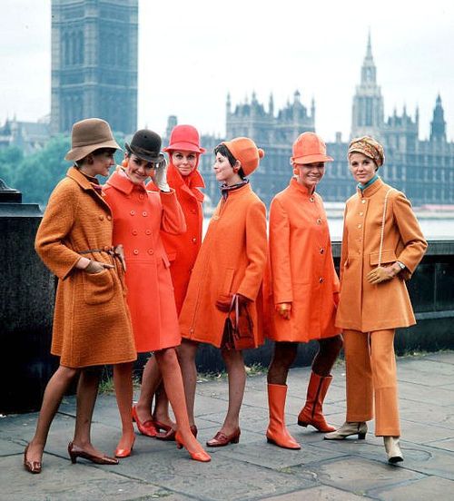
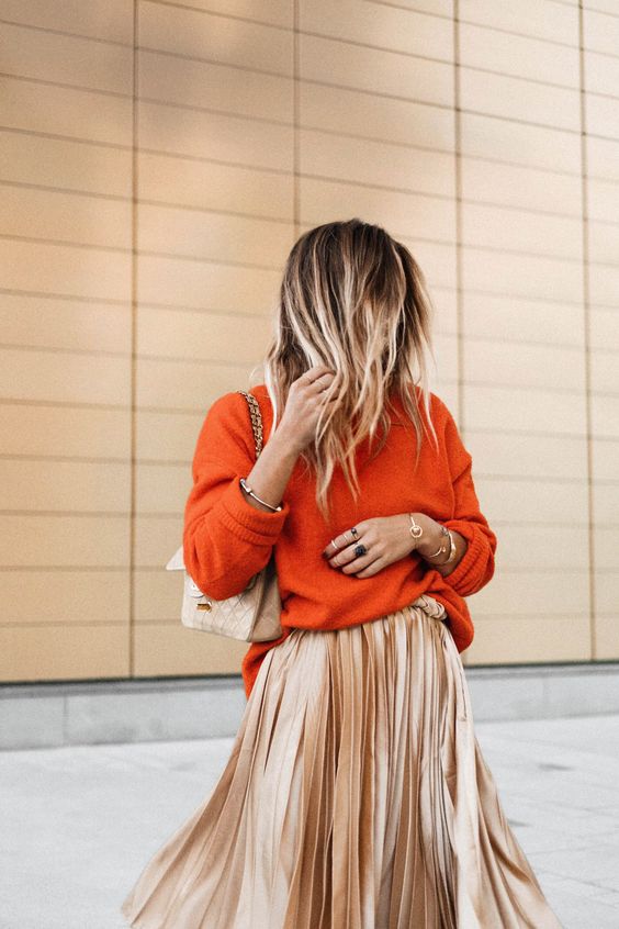
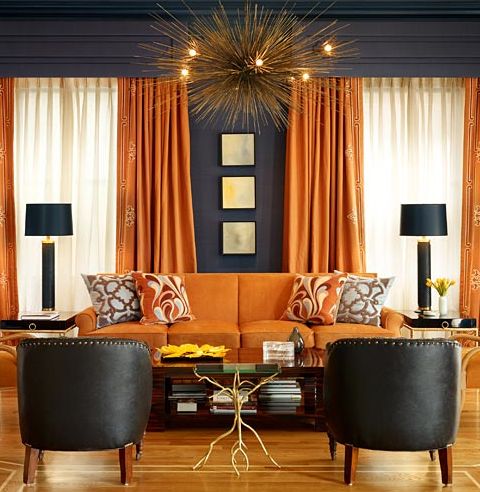
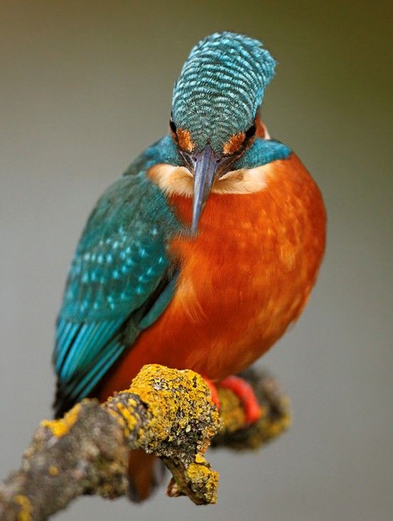
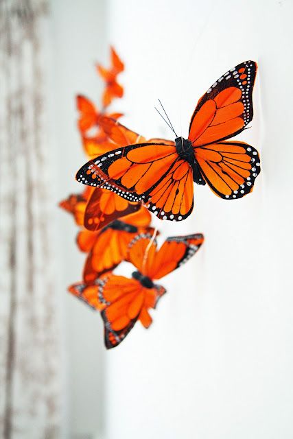
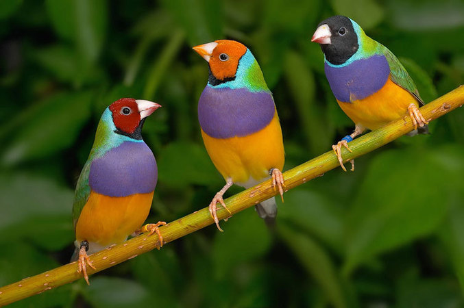
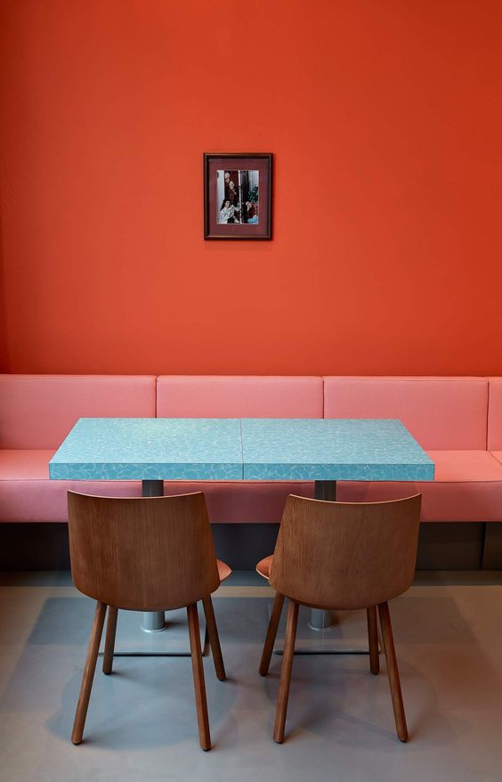
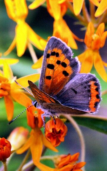
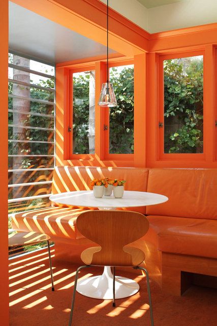
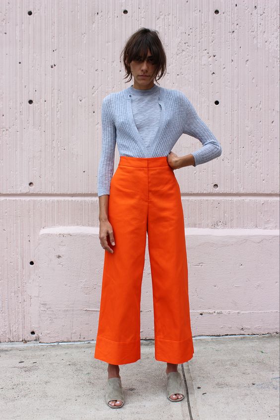
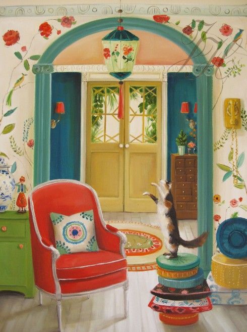
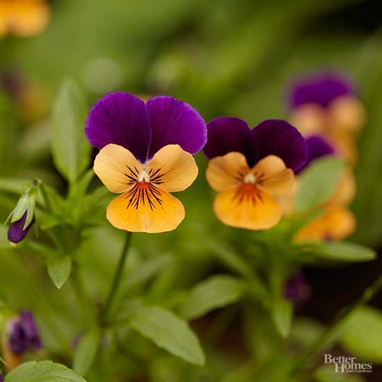
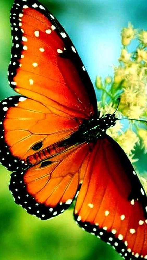
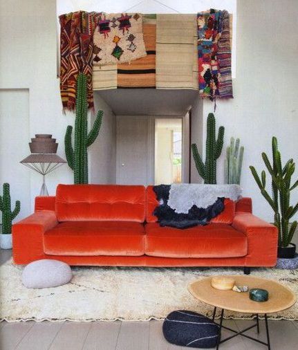
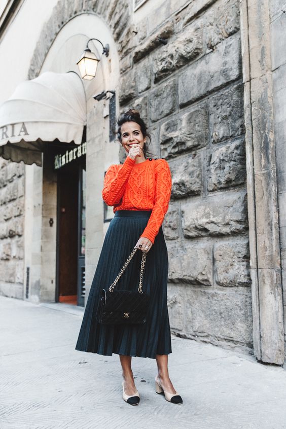
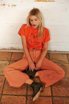
And now an exercise to consolidate the skill. For those who wish. Below I have laid out a lot of pictures with harmonious (and not so) color combinations, with the obligatory presence of orange. Your task is to look at the pictures, catch your emotions and determine the figures that underlie these consonances.
And that's how it is. Holiday greetings!
![]()
![]()

![]()

![]()
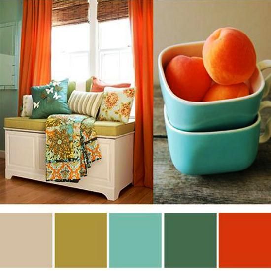
There are several generally accepted approaches to creating harmonious color combinations in clothes, as well as the interior or somewhere else:
- » Monochromatic color combination. In this combination, only different shades of the same color tone are used.
- » Achromatic color combination. Black, white and numerous shades of gray are used to create a composition in this style.
- » Complementary (contrasting) color combination. These are combinations of complementary color pairs based on the representation of the color wheel.
- » A combination of three equally spaced shades. In this combination, three shades are used on the color wheel, located at the same distance from each other. To achieve this, you can inscribe an equilateral triangle in a circle and twist it in different directions.
- » Total look in one color. To create the composition, use only one color for the entire outfit. Small inclusions are allowed contrasting color in accessories.
- » Combination of warm and cold tones. These are complex combinations that can be recommended to people with a well-developed sense of style. To simplify such combinations will help the introduction of a third achromatic color into the ensemble.
Let's look at all the nuances of these techniques in relation to the compilation of a stylistically consistent wardrobe, as well as some specific methods of matching colors.
Monochromatic color combination
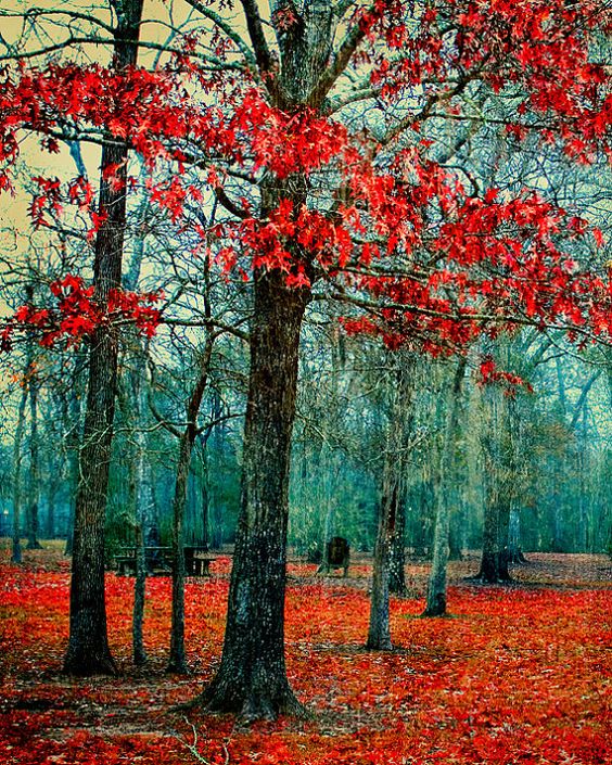
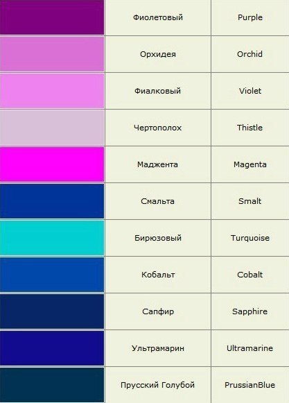
Monochromatic color combination means a combination of three or more shades of the same color. Clothes in such colors leaves an impression quite simple, but at the same time soft, fashionable, feminine and noble. It is important to note that in some cases, very similar shades within the same tone can merge and create disharmony. To avoid this, it is worth considering not only the shades within the same tone, but also the consonant shades of the adjacent tone. Let's take a look at a specific example. The blue tone has several shades: cyan (blue-green or "aqua"), azure, neon, ultramarine, cobalt blue, etc. Since these are all shades within one tone, any combination of them is called monochromatic. Now let's remember the children's countdown: "Every hunter wants to know where the pheasant is sitting." It lists in a specific order all seven colors of the rainbow: red, orange, yellow, green, blue, blue, purple. Thus, for blue, cyan and violet are adjacent. And we will look for an additional color for our ensemble precisely among the variety of shades of blue (aquamarine, turquoise, electric blue, etc.) or violet colors (indigo, lavender, purple, etc.).
Achromatic color combination
As you know, achromatic colors are devoid of tone. There is only one maximum black and one maximum white color and an infinite number of light and dark shades of gray, which can be expanded into a continuous scale between white and black. The indisputable advantage of achromatic colors is that they are an excellent background for any other tones.
Achromatic colors are compatible with almost any chromatic color with a few exceptions.
White color weakens the brightness of adjacent colors and makes them darker, black, on the contrary, increases their brightness and makes them lighter. You also need to know that white and black colors greatly increase the contrast of the chromatic colors next to them. And you should be very careful when playing on very contrasting shades.
Neutral gray is a characterless, indifferent achromatic color that is easily altered by contrasting tones and colors. Any color can immediately bring gray from a neutral achromatic tone into a color range, giving it a shade that is complementary to the color that awakened it. This transformation takes place subjectively in our eyes, and not objectively in the color tone itself. Gray is a sterile, neutral color, the life and character of which depends on the neighboring colors. At the same time, gray is the basic color of our world. We distinguish facial features, individual strands of hair precisely because of the gray shadows that reflect the relief. Grayscale changes help us recognize fabric texture, like so many other phenomena in the world.
Thanks to this versatility, regardless of "color" and "season", each of us can wear dark gray (charcoal color) clothes, but only in the company of colors from the seasonal palette.
Complementary color combination
On the one hand, complementary colors that stand side by side bring each other to maximum brightness. This technique is often used by artists, playing with additional colors where they need to be accentuated. On the other hand, the same colors mixed together give gray. This is very important from a physiological point of view. The human eye is designed in such a way that in order to feel at ease, it needs to see a neutral gray. This is one of the principles of color harmony: two or more colors are mutually harmonious if their mixture produces gray. Our eyes see gray in two situations: when mixing yellow, red and blue, or from complementary pairs. Moreover, any shade simply needs a complementary shade for integrity and harmony. This is easy to verify with a little experiment. The fact is that the human eye, as it were, generates additional color where it is lacking. There are two quarters in front of you. Look at the red square for one minute, then close your eyes and you will see a green square complementary to it. This experiment can be done with any color. Each time you will see its complementary color. 
In addition, it must be remembered that colors that are most distant from each other do not always look good together. These colors, which have great saturation and brightness, often hurt the eye with their contrast. 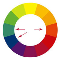 Therefore, if you are attracted by opposite tones, then it is better to choose their muted shades. Sometimes the technique helps when a shade of an adjacent tone is matched to one of the complementary colors and is introduced as a third into the ensemble. It is designed to soften the perception.
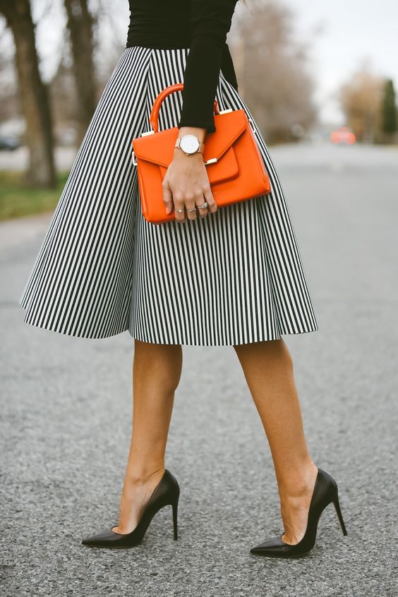
If the contrasting details in your wardrobe are small against the general background, for example, a belt, gloves, a scarf or a hat, then they can have a rather rich and bright shade.
Combination of three equally spaced shades
 The next trick is selection of three equally spaced shades... This method creates an impression of diversity, strength, determination. This can be done as follows: inscribe an equilateral triangle in the color wheel and twist it in different directions. In this case, the vertices of the triangle will always point to three equidistant shades. In this case, the most pronounced color contrast will be given by three colors: yellow, red and blue. And the intensity of the color contrast decreases as the selected colors move away from these three colors. Thus, orange, green and violet in their contrast are already much weaker than yellow, red and blue, and the effect of third-order colors is even less pronounced.
Total look in one color
The outfit looks stylish and harmonious, which is designed in a single color, and small details and accessories have a shade that contrasts with the main tone of the ensemble. Wearing the same color speaks of a classic, simple and formal look.
Combination of warm and cold tones
If you want to combine in one ensemble cold and warm colors, it is important to know that cold colors give the impression of transparency and lightness and, in most cases, are used too light, while warm colors, due to their opacity, are used too dark. And any achromatic color or its shade will serve as an excellent conductor between these two poles. Using this simple trick, you are likely to immediately discover a good harmonious color combination.
Active colors - yellow and red, always prevail over passive - blue and green, so it is advisable to use them in small doses. But when choosing the color of accessories, red is more appropriate than blue and green, which are not so “striking”.
A good, harmonious color scheme does not only depend on the sense of taste. To a much greater extent, it also depends on the specific colors chosen, on their ratio in the painted surface, on their mutual comparisons and contrasts. It happens that inconsistent color pairs can be made harmonious by changing the texture of fabrics.
What is a harmonious composition
Harmonious composition - it is always a proportional composition in which the size of color spots is inversely proportional to their effective brightness. The lighter and brighter the spot, the less area it should occupy. Dissonances are unacceptable in a harmonious color composition; psychologically negative colors that cause a feeling of disgust are impossible. In it, all color spots are easily distinguishable; too subtle nuances are undesirable here, as well as sharp contrasts. Medium contrast is preferred here.
If color is used in a composition, then the problem of color combination comes to the fore. Artists call this harmony of color.
The same principles apply to color harmonies that are inherent in composition as a whole. The mutual combination and influence on each other depends on many factors (size, location, shape), and there is a lot of subjectiveness in this.
The use of color in any graphic document brings expressiveness and attractiveness and contributes to greater impact. However, the color should not be applied on its own (choosing a color because it is "beautiful red" is a very common mistake), but only as part of a particular color scheme.
For example, one (and not very bright) color introduced into a black and white document has a much stronger effect on attention than the variegation of many bright colors.
There are color systems to help you find color combinations. Let us examine only some of them, the most common ones.
System "black - white"
- black - gray - white
- white gray
- gray - gray
- black gray
There is no need to give examples of the use of black and white in various areas of modern culture - they are too numerous and obvious. This color system is durable and stable over time and space.
System "white - red - black"
- red White
- red Black
This is the first three-color system in history - the "primary triad". Red is the color of life, warmth, fire, energy. Every day morning and evening dawns remind us of the intermediate position of red between black and white - from white day to black night. The primary triad "white - red - black" is as relevant today as at any moment in history.
System "Monochromia"
- one chromatic color + achromatic
- chromatic color with shades
Such a color system is the most economical; it spares the nervous energy of both the artist and the viewer, without requiring switching to different chromatic registers. Monochromia makes it possible to focus the viewer's attention on any one thought, emotion, feeling, association. Finally, if the artist's main tool is form, then he does not need a wide palette - after all, the color comes into conflict with the form and can even destroy it. This is the name of the color composition (system), in which any one chromatic color or its shades dominate. by hue, brightness, or saturation. In either case, the composition can be complemented by achromatic colors.
Color circle
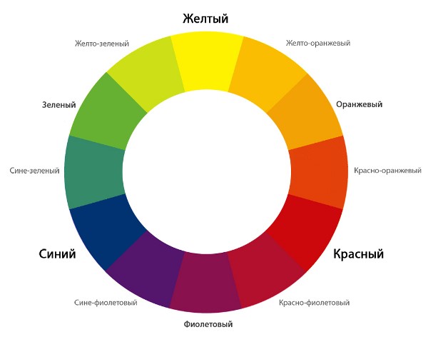
To find harmonious chromatic combinations, we will use the color wheel. Let's draw a circle. We build an equilateral triangle inscribed in a circle. At its vertices we place red, yellow and blue colors... Place orange, green and purple in the middle of each of the three arcs. These are mixed colors of the first stage. Then, in the middle between each pair of adjacent colors, place the mixed colors of the second stage: red-orange, red-violet, blue-violet, blue-green, yellow-green, yellow-orange. It turned out to be a 12-step circle. Using this scheme, you can select harmonious combinations of two, three, four or more colors.
You can approach drawing a color wheel from the other side: we divide the circle into 12 parts, in six parts we put rainbow colors through the gap, considering that blue is a light shade of blue (the English have six rainbow colors!). Place mixed shades in between.
System 4: polar pairs
- complementary colors
- contrasting colors
To a certain extent, the first system "black - white" makes up a polar pair, called achromatic. There are many polar combinations of chromatic colors in nature and art.
System 5: tricolor (chromatic)
- paints at the vertices of an equilateral triangle inscribed in a 12-step color wheel
Color names (for reference):
three primary colors: blue, red, yellow
medium (50%);
weak (min);
strong, spectral (max).
Three degrees of saturation:
darkened, blackened;
bleached, bleached;
medium (50%)
Three lightness of tone:
Three areas of color spot (amount of color):
Three directions of the color spot due to the combination of spots identical in color characteristics:
vertical, horizontal, diagonal;
vertical, diagonal, circular;
diagonal, horizontal, circular;
vertical, horizontal, circular;
vertical, horizontal, circular.
Compositional capabilities of all kinds of chromatic harmonies
Color harmony - a combination of individual colors or color sets, forming a single organic whole and causing an aesthetic experience.
Color systematization - reduction of a set of colors to a system that associates a specific color with a specific point in a plane or space for the purpose of coding and harmonization.
Types of color harmonies
achromatic + color
monochromatic (monochrome) harmony
harmony of related colors
contrast of primary colors
contrast of complementary colors
related-contrasting
Mainse colorand - three colors: yellow, red and blue, which together with their complementary colors form spectral colors.
For example, it seems to many that the sharpest contrast exists between white and black. This is not true. Among the colors that are in contrasting relationships, the pair of white and black is far from the first place. This row: 1 - yellow and black, 2 - green and white, 3 - red and white, 4 - blue and white, 5 - white and black (!), 6 - red and yellow, etc. At the end it is worth the least contrasting brightness ratio of red and green.
Dandmma - in the visual and decorative arts, the integrity of color shades, obtained by highlighting one color as the main color and partially penetrating into all other colors, for example, cold gamut, red gamut, silver, etc.
Valera - tonal nuance in the art of painting, graphics or painting; minimal, subtle difference in lightness of the same color (“write with valers”); valers are achieved by the glazing technique.
Ottenok - slight difference, nuance in color or tone; achromatic shade - a nuance of lightness, the same as valere.
Using spatial color properties
There are forces in color that can reveal depth. The spatial impact of color depends on:
contrast of light and dark
color saturation
the area of \u200b\u200bits distribution
When six colors - yellow, orange, red, purple, blue and green are located on black background one next to the other without intervals, it is clearly visible that the light yellow color seems to protrude, and the violet plunges into the depth of the black background. The rest of the colors form intermediate steps between yellow and purple. white background the impression of depth changes - purple is pushed out by a white background and appears to protrude, while yellow is held by white as "close and akin." These observations prove that for assessing the impression of depth, the overall color of the background is just as important Colour. Here we are faced with the relativity of color exposure.
The ability of color to reveal the depth of space - six primary colors on a black background, in accordance with the stages of their depth manifestation, correlate with the proportions of the golden ratio. The principle of the golden ratio is based on the fact that the smallest segment refers to the largest, as the largest to their total amount. If the distance AB is divided according to the principle of the golden ratio at point C, then this means that AC refers to CB as CB to AB. In the area of \u200b\u200bcolor, this means the following: if we place orange between yellow and red, each of which has its own degree of depth, then the difference in depth between yellow-orange and orange-red will correspond to the ratio of "less" to "more". The same ratio of "less" to "more" exists between yellow-red-orange and red-orange-blue. In the same proportions of the golden ratio are yellow-red and red-violet, as well as yellow-green and green-blue.
Yellow, red-orange, and blue against a black background have the following pattern of deepening: yellow protrudes strongly forward, red to a lesser extent, and blue appears almost as deep as black. On a white background, the opposite impression arises: blue protrudes strongly forward, red-orange remains almost in place, and yellow only slightly moves forward. The ratios of depths between yellow and red-orange, red-orange and blue correspond to the ratios of “more” to “less.” All light tones on a black background will protrude forward in accordance with their degree of lightness. On a white background, the impression will be the opposite: the light tones remain at the level of the white background, and the dark ones gradually come forward.
As for cold and warm colors of the same lightness, then warm colors will come forward, and cold ones tend to the depth.
If meets contrast of light and dark, then the sense of depth is either enhanced by color, or neutralized, or will act in the opposite direction. Equally light blue-green and red-orange behave on a black background as follows: red-orange protrudes forward, and blue-green goes deeper. If the reddish orange is lightened, then it will come forward even more. If you lighten the blue-green slightly, then it will give the same impression of depth as the red-orange, and if it is lightened even more, it will come forward, and the red-orange, on the contrary, will recede.
Saturation contrast causes the following sensations in the perception of color: pure, saturated colors will come out ahead in comparison with colors similar in lightness, but faded. As soon as this contrast is added to the contrast of light and dark, or cold and warm, the impression of depth changes again.
Size contrast color spots play a large role in creating an impression of depth. When there is a small yellow spot on a large red surface, then the red color becomes, as it were, the background and the yellow color in this case protrudes forward. If we increase the area occupied by yellow and decrease the area occupied by red, then a moment may come when yellow will play a more significant role than red. Yellow can become the background and push the red forward.
If we wanted to consider all possible options in terms of changing impressions with respect to color depth, then this would not give us any confidence in the correct creation of spatial balance for each color composition. Here you can count on the artist's personal delicate taste and goals.
In order to observe the spatial possibilities of the diagonals, you need to place yellow, red-orange and blue on a black and white background in two diagonal directions, in one case - from left to right and in the other - from right to left. The problems of creating painterly illusions of depth can be explored by comparing, for example, yellow and blue rectangles in all their possible vertical and horizontal positions, intersections and overlays, using white and black backgrounds. If they want to judge color as a force capable of providing picturesque depth, then for this you need to exercise your vision in perceiving the possibilities of color in building space. "Do not arrange windows, do not make holes in the picture," said Corot, urging painters to be attentive to the overall integrity of the space. A particularly strong sense of the depth of the picture can be achieved by using the interaction of color, vertical and horizontal directions and spatial plans of the composition with each other. As a rule, the space of the picture is built using two, three or more plans. But the most common version of the plane-pictorial transfer of space is based on two plans. Knowledge of the above properties of color allows a more meaningful approach to solving certain coloristic problems in the construction of graphic compositions. However, when implementing an idea, the flow of intuitive sensations should not be constrained by strict rules, since the ideas are always not so unambiguous.
Color harmony is the most important means of artistic expression in painting, along with composition, drawing, perspective, light and shade, texture, etc. The term "harmony" comes from the Greek word hamionia, which means consonance, harmony, the opposite of chaos and is a philosophical and aesthetic category meaning "a high level of ordered diversity, the optimal mutual correspondence of the various in the whole, meeting the aesthetic criteria of perfection, beauty." Color harmony in painting is the consistency of colors with each other as a result of the found proportionality of the areas of flowers, their balance and consonance, based on finding a unique shade of each color. There is an obvious relationship between the various colors of a painting, each color balancing out or bringing out the other, and the two colors together affect the third. Changing one color leads to the destruction of the coloristic, color harmony of the artwork and makes it necessary to change all other colors.
Color harmony in the structure of a painting also has substantive substantiation, reveals the creative intention of the author. For example, Van Gogh wrote: “In my painting Night Cafe, I tried to show that a cafe is a place where you can die, go crazy or commit a crime. In a word, I tried, confronting the contrasts of pale pink with blood red and wine red, pale green and veronese with yellow-green and hard blue-green, to reproduce the atmosphere of hellish hell, the color of pale sulfur, to convey the demonic power of a tavern - a trap " ... Various researchers dealt with the problems of color harmony - Newton, Adame, Mensell, Bruckx, Bezold, Ostwald, V. Shugaev, etc. Normative theories of color harmony are not directly applied in painting, but artists working in painting, design, decorative and applied arts , it is necessary to know the range of scientific problems of the theory of color harmony, which can contribute to a more deliberate and rational approach to solving practical problems of color harmony. Physicists and artists have always tried to bring all the variety of colors the visible world into the system and, thanks to systematization, determine the patterns of harmonic combinations of color tones. The first attempt to bring colors into the system was by Isaac Newton.
Newton's color system is a color wheel made up of seven colors - red, orange, yellow, green, light blue, blue, purple. Later, purple colors were added to the spectral colors, which are not in the spectrum, having received them by mixing the two extreme colors of the spectrum - red and violet. The colors of the red-yellow part of the circle were called warm, and the bluish-blue part of the circle was called cold. This was the first attempt at "color harmonization". In 1865, the artist Rudolph Adams invented the "apparatus for determining harmonic color combinations" - the "chromatic accordion". Adams' color accordion consisted of a color wheel divided into 24 sectors, and each of the sectors was divided into 6 degrees of lightness. Five templates were made for the color wheel, in which 2, 3, 4, 6 and 8 holes were symmetrically cut according to the sizes of the sectors. By moving the hole patterns, different color combinations could be produced, which Adams called "symmetrical chords." At the same time, Adams believed that these "chords" may not necessarily turn out to be harmonious, however, they are the basis for choosing various harmonic combinations of color tones (Fig. 1).
Rudolph Adams Color Accordion (Fig. 1)
Adams formulated the basic principles of color harmony as follows:
1. In harmony, at least the initial elements of the variety of the color area should be noticeable; red, yellow and blue. If they were indistinguishable, as it would be in black, gray or white, there would be unity without diversity, that is, the quantitative ratio of colors.
2. A variety of tones must also be achieved through a variety of light and dark, and through changes in color.
3. The tones should be balanced so that none of them stand out. This moment embraces quality relationships and constitutes a color rhythm.
4. In large combinations, the colors should follow each other in order so that a natural relationship in the degree of their relationship takes place, as in a spectrum or a rainbow. In the succession of tones, the movement of the melody of color unity is expressed.
5. Pure paints should be applied sparingly because of their brightness and only in those parts to which the eye should be directed first.
Adams' theory of harmonic color combinations was of value for the practice of painting. Albert Henry Mansell's theory of color harmony was also directly related to the practice of painting. Mansell defined three types of harmonic combinations of color tones: monochromatic harmonies - built on one color tone of different lightness, or saturation; harmony of two neighboring colors of the color wheel, built on proximity, kinship of colors; harmonies built on the principle of contrast between colors lying opposite each other in a color wheel. Mansell believed that color harmony would be more perfect if the artist took into account the relationship of colors to saturation and the ratio of areas of color planes. The German physiologist Brücke also considered colors that lie within small intervals of the color wheel to be harmonious due to their closeness in color tone. In the theory of harmonic combinations of color tones, Brucke for the first time along with paired combinations different colors distinguished the triads of colors, which he considered harmonic. Brücke considered red, blue and yellow, as well as red, green and yellow colors to be harmonious triads of colors. In his opinion, the colors of small intervals can be attached to these three colors. Bezold, like Brücke, built a theory of color harmonies on differences in colors within small and large intervals of the color wheel. He believed that a harmonious combination of color tones is obtained only when, for example, in a twelve-member circle the colors lag behind each other by four tones, i.e. there should be an interval of three tones between them. Inharmonic color combinations, according to Brücke, are obtained when the interval between colors is only one color tone. Bezold was the first to point out the need to see the difference in the use of color and harmonious color combinations in painting and arts and crafts. Popular in the 19th century. was the theory of color harmony by W. Ostwald, who tried to find mathematical patterns of color harmony from the geometric relationships of the arrangement of colors within the color wheel. Ostwald believed that all colors containing an equal admixture of white or black are harmonious, and of those that do not contain such an admixture, those that stand from each other in the color wheel at an equal number of intervals are the most harmonious. Of interest is his doctrine of achromatic harmony, in which the author found a mathematical relationship between the change in the lightness of the achromatic color and the threshold sensitivity of the eye. Ostwald proved that when the lightness changes, the threshold sensitivity of the eye changes according to the law of the geometric mean. Great interest for artists working in the field of decorative - applied arts and design, is represented by the theory of harmonic combinations of color tones, developed by V.M.Shugaev. The theory of harmonic combinations of color tones by V.M.Shugaev is based on the theories of Mansell and Bezold and is based on combinations of colors of the color wheel. According to the author, the circle is based on four colors: yellow, red, blue and green according to the principle of kinship and contrast. V.M.Shugaev systematized various types of harmonic combinations of color tones and brought them to the main four types:
1. combinations of related colors;
2. combinations of related - contrasting colors;
3. combinations of contrasting colors;
4. combinations of colors neutral in relation to relationship and contrast.
The author has counted 120 possible harmonic color combinations for a 16-member circle with three intermediate colors, three intervals between the main colors. V. M. Shugaev believed that harmonic color combinations can be obtained in three cases: 1) if the harmonious colors contain an equal number of main colors; 2) if the colors have the same lightness; 3) if the colors have the same saturation. The last two factors play a significant role in the harmonization of colors, but are not the main ones, but only enhance the mutual influence of colors, providing a closer harmonious connection between them. Conversely, the more different colors differ from one another in lightness, saturation and color tone, the more difficult they are to harmonize. Additional colors are an exception. The harmony of complementary colors is confirmed by numerous examples in painting and arts and crafts. V. M. Shugaev defined color harmony as follows: “Color harmony is color balance, color balance. Here, the color balance (primarily of two colors) is understood as such a ratio and such qualities in which they do not seem alien to one another and none of them prevails unnecessarily. " "Harmonic combinations are those that give the impression of coloristic integrity, the relationship between colors, color balance, color unity."


