Color harmony is an art and science that has its own laws and rules regarding color, brightness and contrast.
The theory of harmonious color combination is based on the color wheel combinations according to the principle of the relationship of contrasts.
Today, one of the best tools for rendering color combinations is the color wheel.

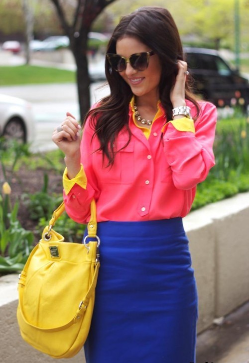
Harmonious combinations.
This table contains only examples of color combinations. You can use different color combinations as well as tones and midtones. Use these rules when choosing kits and you will always look harmonious and stylish.
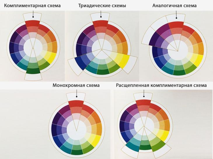
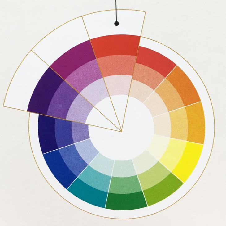
Monochrome scheme
Consists of colors from one sector of the color wheel, where the color is represented by different shades and tones. This understated, soothing color scheme helps create sophisticated, noble and elegant combinations.


A monochrome scheme can be enlivened or complemented with a neutral color.
Similar scheme
Any two or three adjacent colors in color wheelincluding their shades and tones. These combinations look harmonious, calm and inviting.
A dramatic effect is achieved when colors of the same lightness and saturation are used in the scheme. These colors are perfectly combined and produce a harmonious, eye-pleasing impression.

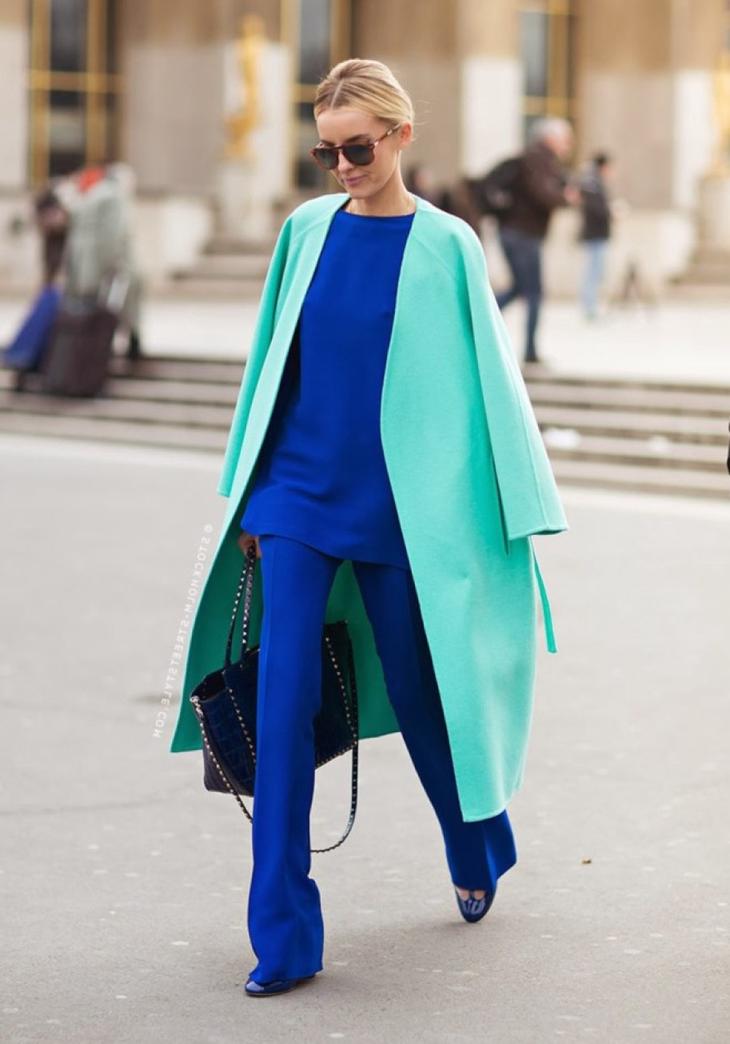

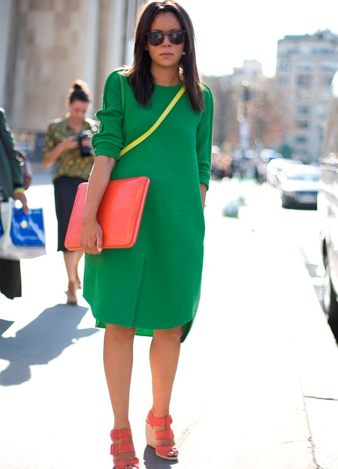
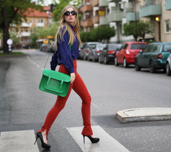
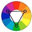
Complimentary scheme
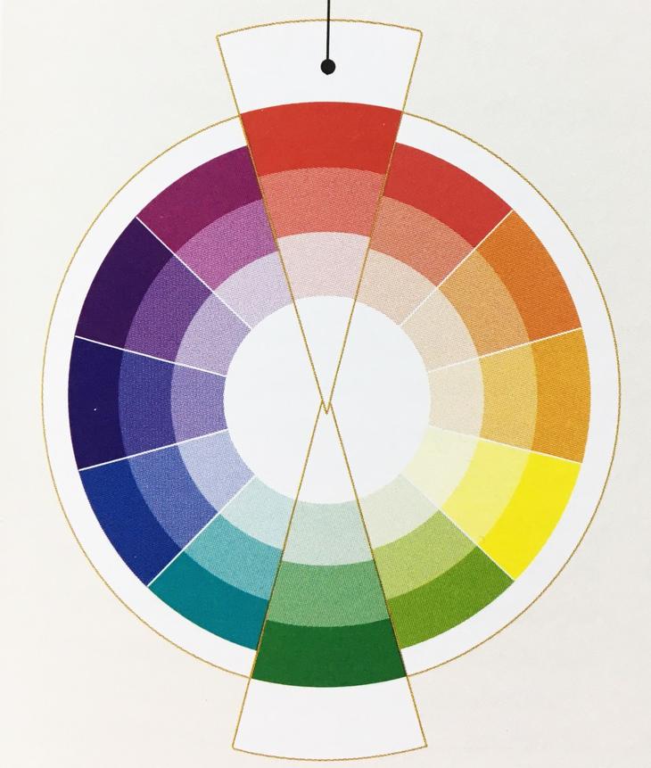
A complimentary scheme uses two opposite colors in a color wheel. These colors reinforce each other, creating the effect of visual vibration. The scheme is catchy, dynamic, memorable and creates a lively dramatic effect.
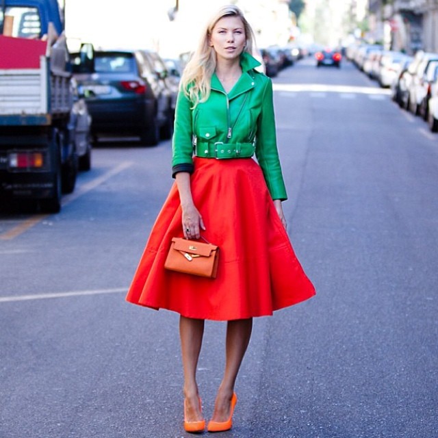
Colors that are used in a complimentary scheme do not have to be bright, striking. You can work with pastel or muted colors, which are conducive to a calm mood.
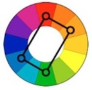
Split complementary scheme
This is a scheme in which one of the opposite colors is replaced by two nearby colors. This scheme is more pleasing to the eye than the complimentary one. Creates bright, playful, upbeat combinations.

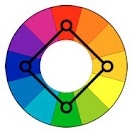
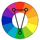
Equidistant scheme
A combination of three colors equidistant in the color wheel.

The primary scheme is a combination of the three primary colors. A secondary scheme is a combination of three secondary colors. A tertiary scheme is a combination of three tertiary equidistant colors.
Color harmony is the consonance of colors, their compatibility, a beautiful ratio. Often, artists achieve harmony in their works, relying on intuition and an inner sense of color. This feeling grows in the process of constant work. However, harmony in color is based on certain laws. In order to understand these patterns, you need to use the spectral wheel or color wheel.
Three primary colors.

A color wheel is a scale of shades of color arranged around a circle. These colors are arranged in a specific sequence - just like in a rainbow. Therefore, the color wheel for the artist is almost the same as the periodic table for the chemist. Among all the colors of this circle, there are three, which are called basic: yellow, red and blue. All a huge variety of other colors are formed by mixing these three (this is applicable for the light reflected from objects in the CMYK color model; if the light is emitted as on a monitor, then this is the RGB color model and here the mixing occurs according to other laws, between green, red and blue) ... But in practice, it is not always possible to achieve the desired color sound, since paint pigments have certain limitations. For example, if you mix red (scarlet) and blue (azure), you get a dirty purple color. If red (kraplak) and blue (ultramarine), then pure purple... But this is not always enough, therefore, cobalt violet or purple kraplak are also produced. Its color is very intense and clear. Thus, despite the fact that in theory you can get all the colors from just three basic ones, in practice artists use a large number of colors. However, the main ones are blue, red and yellow. On the color wheel, their positions form an equilateral triangle. These colors cannot be obtained by mixing others.
Color saturation and brightness.
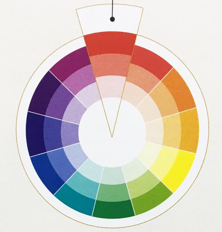
![]()
Any color has a number of characteristics. The main things for an artist are saturation and brightness. These are different concepts. Brightness refers to how much the selected color is lit. That is, any color can be lighter or darker with the same saturation (close to white or black). Saturation means the strength of the color, so to speak, its "richness". It can be different at the same color brightness (or illumination). The lower the saturation of the color, the more it approaches gray shades. You can clearly see this in the given table of colors.
Harmony contrasting colors.
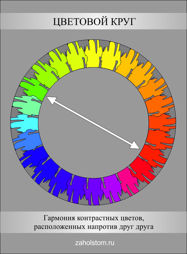
The color wheel has colors that are opposite each other. These are contrasting colors. They form the most contrasting combinations. For example, if red is placed next to orange, then it will not stand out much. But if the same red color coexists with green, then it will seem to "burn". That is, green and red reinforce each other, create contrast. If you look closely, then red and green are located in the color wheel exactly opposite each other. There are three pairs of contrasting colors: red-green, yellow-violet, orange-blue. These are opposite colors, forming the most contrasting combinations.
Harmony of related colors.
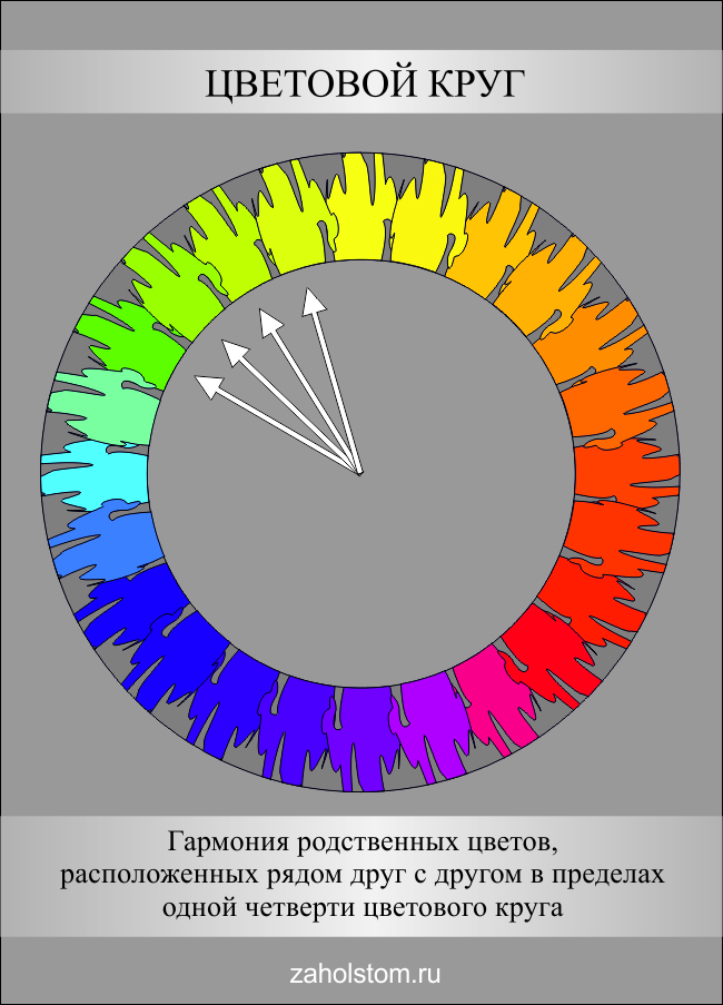
Colors located within one quarter of the color wheel and having one common shade in themselves are called related. They seem to be "related" by the common color contained in them. There are many related flowers. For example, red, red-orange, orange-yellow. They all have a red color. This unites them. Therefore, they are called related. There are the following four groups of related colors: yellow-red, red-blue, blue-green, green-yellow.
Harmony of related contrasting colors.

Relatively contrasting are contrasting colors that contain one common color that unites them. Relatively contrasting colors are located in two adjacent quarters of the color wheel. There are four groups of related-contrasting colors: yellow-red and red-blue, red-blue and blue-green, blue-green and green-yellow, green-yellow and yellow-red.
Chromatic and achromatic colors.
![]()
All colors except black, white and gray are called chromatic. Accordingly, achromatic colors are shades of gray, white and black.
Warm and cold colors.
![]()
Warm colors are yellow, orange, red, brown, beige and many similar shades. These colors are associated with the warmth of fire. Cool colors: blue, cyan, purple, green, as well as a large number of colors derived from them. Cold colors are associated with coldness, freshness, spaciousness ...
AESTHETIC COLOR ASSESSMENT
1. Color harmony.
2. Color preferences.
3. Color symbols.
LITERATURE.
1. Zeigner G. Teaching about color. M., Stroyizdat, 1971.
2. Mironova L.N. Color science. Minsk, Higher School, 1984.-p. 187,189
3. Freeling G. Auer K. Man-color-space. M., Stroyizdat, 1973.- p. 12-13.
4. Zaitsev A. Color Science and Painting. M., Art, 1986.-p.87
5. Yuriev F. Color in the art of books. Kiev, "Vishcha School", 1987.-p.37-59.
6. Harmony of color. / Practical catalog of extended color gamuts with decoding of all shades using the CMYK system /. Moscow-Minsk, AST-Harvest, 2005.
Color harmony
The concept of "harmony"
Harmony /gr.- harmonia - connection, harmony, proportionality / - proportionality of parts and the whole, fusion of various components of an object into a single organic whole. In harmony, internal order and a measure of being are externalized.
The term "harmony" as an aesthetic category originated in Ancient Greece... This category is associated with concepts such as measure and proportionality, co-scale with a person. The harmonious, according to the concepts of ancient people, was necessarily sublime and beautiful. With regard to color, in painting the concept of harmony was interpreted as a clear distinguishability of colors and at the same time their closeness, softening of relations by shades and chiaroscuro, a small number of dominant colors and clarity of the type of color composition.
The detailed theory of harmony was given by G. Hegel. Formulating the three main points of harmony - internal unity, integrity and coherence, he meant by this the meaning of qualitative differences within the system: "Harmony is the ratio of qualitative differences taken in their totality and arising from the essence of the thing itself"
Modern aesthetics interprets harmony as a form of ideal expression. Rejecting the normative interpretation of harmony as the external coherence of parts and the whole, as the absence of conflicts, she understands harmony as a reflection in art of the unity of opposites and laws of development of reality.
Color harmony in design is the consistency of colors with each other as a result of the found proportionality of the areas of color spots, their balance and consonance, based on finding a unique shade of each color.
Harmony should evoke certain positive emotions in a person.
The essence of harmony is that color combinations create comfortable conditions for perception. And such conditions are created by the color balance.
Types of harmonic color combinations
There are harmonies built on nuance color combinations - nuance harmonies, and harmonies built on contrasting color combinations - contrasting harmonies.
Nuance harmonies are subdivided into:
- monochrome - built on a combination of colors of the same color tone, while the series can be used: light, shadow, equal saturation, etc. as a result, one can achieve, on the one hand, a strong tonal contrast, and on the other, subtle color relations;
- polychrome - built on a combination of colors located in the color wheel within 70 *. Such color combinations are called similar... Due to the proximity of the location, these colors can be easily combined. This harmony can have a lot of depth, rich variety and elegant look.
Contrasting harmonies are built on:
- color pairs - dyads - two additively complementary colors located on the diameter of a 24-color, equistep, additive color wheel; This includes "Harmony of an isosceles triangle". These colors are softer than combinations of just two complementary colors;
- color triads- three colors, located at equal intervals in a 24-color, equal-step, additive color wheel / color triangle /;
- color quartets- four colors, located at equal intervals in a 24-color, equal-step, additive color wheel / color square /;
- a combination of chromatic and achromatic colors.
Principles color harmony.
1. Communication - (coherence, alignment of color elements to each other). Carried out:
a) in nuanced color harmonies - due to the proximity of color elements in color tone (within 45 degrees in a 24-color color wheel);
b) in contrasting color harmonies built on color pairs, triads, quartets:
Due to the convergence of color elements in lightness - general whitening or general blackening of all color elements of the composition;
By reducing the saturation of all color elements of the composition (adding to all color elements gray equal to them in lightness);
At the expense of color - adding a dose of dominant color to accompanying colors.
2. Unity of opposites
In color compositions, contrasts are required:
In nuanced harmonies - contrasts in lightness and saturation;
In contrasting harmonies - according to color tone and lightness (or saturation).
Unity is ensured by the first principle (LINK).
3. Measure.
The criterion for the measure is the idea of \u200b\u200bthe product. The exponents of the measure are color relations and proportions.
4. Order and organization .
The order and organization are determined by the idea of \u200b\u200bthe work. The ordering of color elements is carried out using such patterns of composition as meter, rhythm, symmetry, etc. Organization - by subordination of color elements, i.e. determination of the main, dominant color, which can prevail quantitatively (in area) and qualitatively (in saturation) and the subordination of accompanying colors to it quantitatively or qualitatively.
5. System stability .
The color composition should be balanced.
6. CLEAR SYSTEM STRUCTURE, SIMPLICITY AND LOGICITY, BOTH IN GENERAL, AND IN PARTS. (Ingenious is always simple).
7. CONFORMITY.
This principle assumes the correspondence of the selected color means to the idea of \u200b\u200bthe work.
8. PERFORMANCE.
This principle presupposes the optimal choice of color means sufficient to expressively reveal the idea of \u200b\u200bthe work. MINIMUM FUNDS - MAXIMUM EXPRESSION!
Color preferences
“There are no comrades for taste and color,” says a popular proverb. One looks more beautiful blue, the other - green. Indeed, the attitude to the color of an individual is subjective, but basically it is based on objective laws.
Color preferences to a certain extent depend on the physiological properties of the organism.
People with a healthy, tireless nervous system: children, youth, adolescents, peasants, people of physical labor, who have an ebullient temperament and an open, direct nature, prefer simple, clean, bright colors; contrasting color combinations that act as strong irritants.
Indeed, such colors and color combinations are found in children's artistic creation, in youth fashion for clothes; in the decorative and applied art of the entire globe, in ancient Russian monumental painting, in amateur "urban folklore", the creators of which are people of unintelligent labor, in the art of revolutionary artists of the 20th century.
People with a tired and finely organized nervous system - middle-aged and elderly people, prefer intelligent work: complex, low-saturated (whitened, broken, blackened), achromatic colors, nuanced color combinations that calm rather than excite, cause complex ambiguous emotions, need longer contemplation for perception, satisfy the need for subtle and refined sensations, and such a need arises in subjects of a sufficiently high cultural level.
Such colors and combinations are found in European costume for middle and old age, in painting and applied art of classes leaving the historical arena (XVII century - Rococo, XIX and XX centuries - modern); in modern design graphics and coloring of most architectural objects.
These summarizing psychophysiological data and numerous studies of scientists allow us to determine the further differentiation of color preferences for various social groups:
a) depending on age:
the scale of a person's favorite colors changes throughout his life:
preschool children prefer red to all others.
Among children of primary and secondary school age, preferences are divided as follows: for boys (7-8 years old), the most favorite color is red, and in second and third place is yellow. Havegirls of the same age in the first place - blue.
Among adolescents and adults, colors are distributed in popularity as follows: blue, green, red, yellow, orange, purple, white.
Children, adolescents, young people generally prefer simple, clean, bright colors, contrasting color combinations; middle-aged and elderly people prefer complex, low-saturated, achromatic colors, nuanced color combinations.
b) depending on gender:
The English scientist W. Winch, as a result of a survey of two groups of men and women, received a cross-alternating pattern of color preference for men and women:
But within any group of subjects there are deviations, depending on the nature of perception and other individual characteristics of a person.
c) depending on the nature of work:
Manual workers prefer simple, clean and bright colors, contrasting color combinations.
People of intellectual labor prefer complex, low-saturated, achromatic colors, nuanced color combinations that cause complex ambiguous emotions that need more prolonged contemplation.
Color sympathies of various social groups, both small and large, are most directly manifested in arts and crafts, amateur painting and graphics. On these objects it is possible to study living color in the process of its own life and interaction with a person. A complete picture of color preferences, along with knowledge of the psychophysiological characteristics of individual social groups, can be obtained on the basis of studying the history of art of a given social group, nationality, and nationality.
Skillful use of color preferences is a powerful weapon in the artist's hands. This is one of the factors in increasing the effectiveness of visual information. After all, from whether you like or dislike a color or color combination, information may or may not be perceived. When developing the color composition of an object, it is necessary to clearly imagine who will perceive it: people of physical or mental labor, young or old, etc. Of course, you will not take into account everyone's tastes, you need to focus, if possible, on the overwhelming majority. Take, for example, an industrial workshop and a research institute. Let's say that the workers of the shop will perceive bright and sonorous colors, and the employees of the research institute will give preference to muted colors, nuanced color combinations. However, the workshop has an administrative building, in which people of intellectual labor work, and they can give preference, respectively, to soft, nuanced color combinations. At the same time, usually in the administrative building there is a red corner where the workers of the shops gather, which means that it is necessary to focus on their preferences. Thus, a strictly differentiated approach is required to determine the color scheme of an object, depending on the functional purpose of its location, and, accordingly, the audience for which it is intended.
Color preferences, as well as associations, are determined by many factors. Usually, you should take into account the preferences of not only individual colors, but also combinations. In this case, an object plays an important role - a carrier of color. The assessment of the color itself can differ in any way from its assessment in a particular situation. Therefore, data from laboratory studies of color preferences cannot serve the only onethe basis for the development of the color composition of the object, even if we talk about its elementary aesthetic qualities.
A more accurate, albeit more complex, way to study color preferences can be research of artistic creativity,for example, decorative and applied art, amateur painting and graphics of a particular social group of people. In these areas, color sympathies manifest themselves quite directly, and at the same time, any color is included in the composition, is associated with material and texture, that is, on these objects one can study not a prepared, but a living color, in the process of his own life and interaction with human. A complete picture of color preferences can only be obtained by studying the history of the art of a given nation.
Color symbolism
The problem of color symbolism is closely related to the problem of the psychological impact of color, as well as to its systematics. At the origins of culture, color was equivalent to a word, served as a symbol of various things and concepts.
In certain periods of the history of the world fine arts, symbolism played a particularly important role in the ideological and figurative content of a work of art. A particularly prominent role belongs to the symbolism of color in the art of the Middle Ages, under the dominance of religious ideologies, when interest in one color or another was supported, in particular, by the belief in the supposedly magical power of color. This influenced the understanding of color among the artists of that era, which found its expression in the corresponding principles of harmonization. Each country had its own symbolism, but it also had deviations. For example, in the Middle Ages, red was simultaneously considered the color of beauty and joy, and the color of anger and shame. Red beard and hair were considered a sign of betrayal; at the same time, positive characters were endowed with a red beard.
Disagreements in the symbolic content of flowers in the same era and in the same country can be explained by the intersection of religious symbolism with folk. If the first of them had its origins in religious teachings, legends and tales, then folk symbolism was the result of the reflection in the minds of the people mainly of the colors of the surrounding nature and was based on color associations. Each color is diversely associated with various objects and phenomena of reality. So, for example, red is associated with blood, fire, since ancient times it symbolizes life. Hence, he is also a symbol of the power of fertility and love. At the same time, the closeness of red to blood makes it a symbol of suffering, anxiety, war, even death. At the same time, red is a victory, a celebration, a sign of fun. In modern history, red becomes a symbol of the proletarian revolution. Thus, a variety of associations gives a plurality of symbolic meanings to the same color. The traditional, symbolic meaning of color, which arose in ancient times on the basis of associations, under the influence of industrial and everyday rituals, mythological and religious views, still exists among the people. And now the artist, whether he wants it or not, is forced to reckon with these traditional views of people on color symbolism. Color symbols help the perception of the work, act as additional content. The artist's skill lies in how, in what form, he presented these symbols.
Color symbols are as diverse as a person's life, they reflect negative and positive traits of his character, phenomena of reality. In this regard, it is advisable to subdivide them into associative, positive and negative (see Table 1)
Table 1. Color symbols.
| Colour | associations | symbols | ||
| associative | positive | negative | ||
| white | light, silver | Light, Silver | Spirituality, Purity, Clarity, Innocence, Truthfulness | Death, Mourning, Reaction |
| the black | darkness | Darkness | Land | Death, Mourning, Reaction, Backwardness, Crime |
| yellow | Sun, gold | Sun, Light, Gold, Wealth | Wealth, Joy | Separation, meanness, deceit, envy, jealousy, betrayal, madness, treason |
| Orange | Sunset, Autumn, Orange | Warmth, ripeness | Energy, Labor, Joy | Betrayal, Treason |
| red | the fire | Life, Strength, Passion | Love, Victory, Celebration, Holiday, Fun, Democracy, Revolution, Fight for freedom | War, Suffering, Death, Violence, Anxiety, Anger |
| purple | Wealth, Power, Power | Dignity, Maturity, Splendor | Cruelty | |
| Violet | Violet | Faith, Conscience, Artistic giftedness | Humility, Old Age, Sadness, Calamity, Mourning | |
| blue | Sea, Space | Possession of the sea, Infinity, Space | Wisdom, Loyalty | Longing, Coldness |
| blue | Sky, Air | Peace, Peacefulness | Innocence | |
| green | Nature, Vegetation | Nature, Fertility, Youth, Peace | Hope, Blossom, Security, | Yearning |
Of certain interest is also the classification of color symbols according to their similarity with the characteristic features of the designated object of the concept, proposed by F. Yuriev.
All symbols are divided into three groups: associative, associative-code, code.
Associative group includes the most common and most ancient mimetic designations that bear direct resemblance to the characteristic features of the concept object. Thanks to naturalistic associativity, these symbolic designations are primary in all cultures and the most tenacious:
white - Light, Silver;
black - Darkness, Earth;
yellow - the Sun, Gold;
blue - Sky, Air;
red - Fire, Blood;
green - Nature, Vegetation.
Associative code a group of symbols has a wider range of associations. It includes symbolic designations that have a distant resemblance to the characteristic features of an object-concept and in a specific clarifying situation acquire a cognitive meaning. As a color metaphor, associative-code designations acquire expressive meaning in art. An example would be the following matches:
white - Luminosity, Spirituality, Purity, Innocence, Clarity;
black - Absorption, Materiality, Hopelessness, Heavy;
yellow - Radiance, Lightness, Dynamism, Joy, Closeness;
blue - Heaven, Depth, Infinity, Cold, Impassivity;
red - Activity, Violence, Excitement, Passion;
green - Calm, Safety, Static, Beneficial;
Character code group - the most conditional. Here, the color has no resemblance to the designated object - concept and almost any designation can be used, for example:
yellow - Wealth, Envy, Jealousy, Insidiousness, Treason, Separation, Mental imbalance;
blue - Religiousness, Wisdom;
red - Democracy, Evil;
green - Immediacy, Longing.
In the first and second groups, the symbols are quite realistic, because they are associatively associated with various objects and phenomena of reality and therefore are similar in many cultures. Differences are manifested and exacerbated where color coded symbology prevails. These differences need to be taken into account, depending on the region in which the artist works. Folk art, literature, art will help to identify and understand them.
There is also international color heraldic symbols, as a sign system that is strictly observed in the coats of arms and flags of states. In modern international heraldic language, it has the following interpretation:
white - Silver, Purity, Truthfulness, Europe, Christianity;
yellow - Gold, Wealth, Courage, Asia, Buddhism;
red - Strength, Democracy, Revolutionary, America;
green - Fertility, Prosperity, Youth, Australia, Islam;
blue - Innocence, Peacefulness;
blue - Wisdom, Possession of the sea;
purple - Sadness, Calamity;
black - Mourning, Death, Africa.
In Olympic symbolism, the colors of the rings are symbols of the five continents:
blue - America;
red - Asia;
black - Europe;
yellow - Africa;
green - Australia.
The color itself cannot be a symbol. In a work, it necessarily belongs either to the pictorial, or volumetric, or to the spatial structure, where it occupies a certain place due to the composition and ideological intent, which in turn contribute to the identification of its symbolic content. Thus, the perception of the symbolic meaning of color depends on:
From the general concept of the work; from the general color compositional construction; from the flowers surrounding him;
From a specific pictorial structure, the form to which it belongs.
S. Eisenstein, in connection with his work on color cinema, investigated the question of "absolute" correspondences between sound and color. He came to the conclusion that “in art it is not absolutecompliance, and arbitrarily shaped,which are dictated figurativesystem of this or that work. Here the matter is never resolved and will never be resolved by an immutable catalog of color symbols, but emotional meaningfulness and efficacy of color will always arise in the order of the living formation of the color-like side of the work, in the very process of forming this image, in the living movement of the work as a whole ".
One cannot but agree with this conclusion. Everything said is true, except for the word "arbitrary." The artist "paints" the image not arbitrary,he considers the traditional color meaning and obeys it or gives their own, oppositevalue. Following the above paragraph, S. Eisenstein describes an example from his practice that confirms just such conditionedapproach to the color scheme: “it is enough to compare the theme of white and black in the films“ Old and New ”and“ Alexander Nevsky ”.
In the first case, reactionary, criminal and backward were associated with black, and joy, life, new forms of management with white.
In the second case, the theme of cruelty, villainy, death fell to the share of white with knightly vestments (this was very surprising abroad and was noted by the foreign press); the black color together with the Russian troops carried a positive theme - heroism and patriotism. "
Such a permutation of black and white does not contradict the usual symbolism of these colors: in Russia, for example, the color of mourning is black, but the burial shroud is white; in Japan and India, the color of mourning is white. It would be more surprising and probably misunderstood if Eisenstein replaced, for example, black with yellow-green, and white with gray.
Color harmony
The phenomenon of color is far from simple. As already noted, on the one hand, color refers to the physical properties of reality, it can be measured using instruments, and its properties can be mathematically modeled as it happens in colorimetry, and as such, color has an objective meaning. On the other hand, color is a subjective psychophysiological sensation that is embodied in certain emotional states that are different in different people; moreover, this ambiguity of it is the main interest for the fine arts.
When analyzing the technology of a color image, it is necessary to remember all the time about these two of its hypostases: natural science and psychoaesthetic. If we consider the phenomenon of color in historical terms, then these two approaches reveal themselves quite clearly. At the same time, attempts to understand what color is and what is its meaning in the visual arts and in culture in general are always expressed in the desire to somehow systematize color, create a single system, and on its basis penetrate the secret of harmonic combinations. It is quite possible that color harmony is not an objective reality that only needs to be discovered, as many believed after Newton, but just a property of our aesthetic consciousness, as Goethe believed; harmony does not exist outside of our perception, just as the concept of color does not exist outside the perception. Therefore, in different historical eras, different nations various harmonic combinations prevailed, or rather, completely different color combinations were considered harmonious or inharmonious.
Let us trace in the most general terms the dynamics of the change in the color ideal using the material of fine art. But first, a few words about the symbolism of color.
The problem of color symbolism is connected with the psychological impact of color, and with its systematics and classification. At the origins of culture, color was equivalent to a word, since it served as a symbol of various things and concepts, and the simplest or basic colors turned out to be the most stable color symbols. It is noticed that the role of color symbols in society is proportional to the share of mythologism in its thinking. As the role of rationalism grows, so does the role of symbolism. In our time, color symbols retain their positions in heraldry, the functional coloring of production facilities, in traffic signaling and in surviving everyday ritual activities.
In more complex cases, as, for example, in art, the treatment of color allows for the same freedom (or rather, ambiguity in interpretation) as the treatment of a word in modern literature. Today, some theoretical assumptions in coloristic decisions based on the symbolism of color seem in many ways too speculative and unconvincing. The color scheme itself can be very interesting and innovative (as, for example, in the film by cameraman V. Storaro "The Reds"), but theoretical justifications based on subjective symbolism seem to be completely unnecessary props; there is even some degree of mystification in all this. So, Storaro argued that gray-brown tones in his film symbolize the earthly aspirations of the characters, like the roots and trunk of a tree, and green and generally saturated shades corresponding to the fresh greenery of the crown and flowers symbolize their inner, spiritual world.
In the future, analyzing the issues of color, we will talk in detail about the specifics of the film color, about the metaphoricality of color in cinema, but here I would like to note that discussions about the symbolism of color in cinema are mostly artificial and far-fetched.
In the era of Greco-Roman antiquity, color became the subject of attention and reflections of philosophers, but the views of color philosophers can be called artistic rather than scientific, because their perception of the world was based on aesthetic and even ethical preconditions. Ancient philosophers considered it necessary to classify colors - to highlight the main and derivatives, but they approached this mainly from mythological positions. In their opinion, the main colors should correspond to the main elements (air, fire, earth and water - white, red, black and yellow). Nevertheless, Aristotle already knew the phenomenon of color induction, simultaneous and sequential color contrast, and many other phenomena that later became the basis of physiological optics. But the most important thing is the teaching about color harmony.
Ancient color aesthetics became the same foundation for the entire European art of the Renaissance, as ancient philosophy for the science of the Enlightenment. Harmony was considered a universal principle of the universe and was applied to a multitude of very diverse phenomena: to the structure of the Cosmos, to social order, to architecture, to the relation of colors and numbers, to music, the human soul, etc. In its most general form, harmony meant the principle of a higher, "divine" order, instituted not by man, but higher powers, but despite this, such an order should be fully understandable for a person, since it is based on reason. This, by the way, is the difference between the Western concept of harmony and the Eastern one, in which there are always elements of mysticism and unknowability.
Here are some of the provisions of ancient harmony in relation to color:
1. Communication, combination of individual elements of the system with each other. Harmony is the linking principle. In color, this is expressed by the unity of the color tone, when all colors are brought together, as it were, with a common bloom, each paint is either whitened (in the background), or blackened, or softened by mixing in another paint. Apelles, according to Pliny's testimony, having finished the painting, covered it with something like a grayish varnish to bind all the colors into a harmonious unity.
2. The unity of opposites, when there are certain opposite principles, called contrasts. In monochrome, this is the contrast between light and dark, chromatic and colorless (for example, purple with white, red with black), saturated colors with low-saturation. Or is it contrasts in color tone - a comparison of red and green, yellow and blue, etc., i.e. communication of complementary, complementary colors.
3. Harmonious can only be related to measure, and measure is human sensations and feelings. According to Aristotle, every sensation is a definition of ratios. The brightness and color strength should not be too strong or too weak. Bright color, sharp contrasts were considered barbarism worthy of "some Persians" (the original enemies of Hellas). The civilized Greek appreciates beauty more than wealth, the subtlety of art pleases him more than the high cost of material.
4. The concept of measure is relative, it means the ratio of the measured quantity to the unit of measurement, therefore it includes such definitions as proportionality, proportions, relations. Aristotle believed that in “beautiful” colors the proportions in which the primary colors are taken are not accidental: “Those colors in which the most correct proportion is observed, like sound harmonies, seem to be the most pleasant. Such are the dark red and violet ... and some others of the same kind, which are few for the reason that there are few musical harmonic accords. "
The whole practice of antique applied art is based on the principle that mixing is more valuable in color than purity.
5. The harmonic system is stable because it is balanced. The Universe is eternal because it is harmoniously arranged, the opposing forces in it mutually cancel each other out, creating a stable balance. If the figures in the picture are dressed in bright raincoats, then these relatively saturated spots occupy no more than one-fifth or one-sixth of the whole picture in area. The rest of the colors are low-saturated. Light to dark is taken in about the same ratio. Thanks to this proportional system, an overall balance of the color composition is achieved: strong but short pulses of bright and pure colors are balanced by longer, but weak fields of dark and mixed colors.
6. The sign of harmony is its clarity, the obviousness of the law of its construction, simplicity and consistency, both as a whole and in parts. The classical color composition does not ask the viewer difficult tasks, it prefers comparisons of close or opposite colors and is almost never used as the color dominant of the comparison in the middle interval, since there is no obvious connection or opposition in them (more about this will be said on the example of color circle).
7. Harmony always reflects the sublime. According to Aristotle, "mimesis" is a reflection of reality in the forms of reality itself, art only imitates nature, but at the same time does not reproduce the ugly and ugly - this is not part of the task of art.
8. Harmony is conformity and expediency, as well as order. In this principle, in the most general form, the attitude of ancient aesthetics to the world is expressed: the goal of human cultural activity is to transform the formless and ugly world of chaos into a beautiful and orderly space. Any harmonious color composition is so organized and ordered that it is easily comprehended by the human mind and lends itself to logical interpretation.
From this enumeration of the main features of antique color harmony, it is clear that many of them have not lost their significance to this day.
In the Middle Ages, color served as a kind of means of communicating information or a sign that distinguishes certain objects. There was, as it were, a color code that was understandable to all members of society. It was used in all visual structures, in all the creations of human hands that were visible: in architecture, decoration of temples and palaces, in clothing, painting, sculpture, book graphics, theater. Moreover, in relation to different colors there was the same hierarchy as in all other areas of life. There were colors "main, divine": white, gold, purple, red and blue, as well as yellow (he depicted gold). Below on the hierarchical ladder stood green and black. The same colors as gray, brown and the like, as if they were not noticed at all and tried not to use them. It was believed that the contemplation of "divine" and "royal" flowers uplifts the spirit of man, instilling in him a pious structure of thoughts. In France and Italy, the use of blue paint was even controlled by the state, just as it was done in relation to purple in late antiquity. The symbolic meaning of white was enshrined in Scripture, white color meant holiness, faith, etc. Black, as a symbol of death, meant the mortification of the flesh and, in general, was a sign of humility and rejection of worldly joys. Hence the black color of the clothes of the clergy and monks. However, for the higher clergy - the prelates of the Roman Church, the "unrepresentative" black color was replaced by purple, because purple is the closest to black.
During the Renaissance, the works of Leon Batista Alberti (1404-1472) and Leonardo da Vinci (1452-1519) were more closely associated with the practice of fine arts and have not lost their relevance to this day. The issues raised in them can be divided into two groups:
1) all kinds of color phenomena in nature and painting, the effect of illumination on color, reflexes, aerial perspective, the interaction of colors (color induction, color contrasts, the color of the human body, some features of the visual perception of color, irradiation, adaptation and edge contrast);
2) issues of color aesthetics in relation to painting, i.e. which color combinations should be considered harmonious and which should not. Today it is not at all superfluous to recall what Alberti wrote about several hundred years ago: "It seems to me obvious that colors change under the influence of light, because every color placed in the shade does not seem to be what it is in the light."
Unfortunately, for many of our contemporaries this does not seem so obvious. “Colors are very closely related to lights in terms of visibility; and how related they are, you can see by the fact that in the absence of light, colors are also absent, and when the light returns, colors return. "
Essentially, this is the main point that characterizes the entire process of tone and color reproduction when changing the exposure.
In the Renaissance understanding, in comparison with the antique one, the main characteristics of color (hue, lightness and saturation) are already different, as we now say. Interestingly, white and black are denied the names of colors, but they are recognized as the main colors in painting. “Black and white,” writes Leonardo, “although they are not counted among colors,” since one is darkness, and the other is light, that is, one is deprivation, and the other is a product of color - yet I do not want to leave them aside on this basis, since in painting they are the main ones, for painting consists of shadows and lights, i.e. from light and dark. "
Despite the fact that the theorists of the Renaissance are unanimous that the main means in painting are drawing, composition, perspective and chiaroscuro, while color is given a secondary, as it were, a decorative role, they, contradicting themselves, vigilantly note reflexes and painted shadows. Leonardo writes: “The color of the shadow of each object is always involved in the color of the object casting the shadow, and to the greater or lesser extent the closer or farther this object is from this shadow and the more or less luminous. The surface of any shaded body participates in the color of its opposing object. " "White is more susceptible to any color than any other surface of any body, as long as it is not mirrored."
And Alberti writes about reflexes: "A person walking in a meadow in the sun looks green from his face."
Leonardo goes on to say: “It often happens that the colors of the shadows on shaded bodies do not match the colors in the highlights, or that the shadows appear greenish and the highlights appear pinkish, although the body is the same color. This happens if light comes to an object from the east and illuminates it with the light of its radiance, and from the west there is another object illuminated by the same light, but it itself is of a different color than the first object. Therefore, he casts his reflected rays back to the east and illuminates with his rays the side of the first object facing him. I often saw red lights and bluish shadows on a white object.
These observations of Leonardo were used in painting only at the end of the 19th century by the Impressionists, and he himself, contrary to obvious facts, in his artistic practice could not cross the traditions of local painting and warned his contemporaries against this. For artists of the early Renaissance, the color of objects was presented as their integral property, it always acted unchanged and was only diluted or, accordingly, darkened with white or black paint, therefore the problem of color harmony for them was solved by combining subject or local colors, which, accordingly, based on the composition grouped on the plane of the picture.
Everyone knows the masterpieces of the Renaissance, where amazing decorative effects were achieved in this way. These are paintings by Raphael, Michelangelo, Botticelli and other artists associated with the culture of the Correggio Academy. Later, the Renaissance had a completely different attitude to the aesthetics of color comparisons than Alberti and Leonardo, who considered the contrast of local colors to be the basis of harmony. Later, the aesthetics of harmony through opposition gave way to the aesthetics of harmony through analogy, in modern terms. But the bright decorative effect, which is achieved by the harmony of local colors, is still used in painting. For example, in the paintings of Petrov-Vodkin.
There is a curious point of view that explains why Renaissance artists painted in local color. The fact is that the technique in which they worked (tempera) did not allow applying one layer of paint to another. This became possible when the Van Eyck brothers began to use oil paints... If we accept this version, then we have to admit how much technology affects aesthetics, which is confirmed today by the example of color photography, film and television.
The 17th century was a turning point in the history of European culture. Rationalism and mechanism became the main methods of science. Researchers saw their task in dissecting the object under study, dividing it into its component parts, while, of course, analysis dominated synthesis, and a systematic approach, as we say now, in this case was impossible. Despite this, Newton can be considered the founder of the physical science of color, because he put it on a solid foundation of a physical experiment with mathematical processing of the results. He asserted the organic unity of light and color, their physical identity and believed that color is always there and only manifests itself under certain conditions: "I found that all the colors of all bodies are generated only from some arrangement that promotes the reflection of some rays and the transmission of others." ... Newton created an objective physical basis for color taxonomy by enclosing natural spectral colors with magenta and arranging them in a circle.
Fig. 12 Newton's color wheel.
This circle (Figure 12) has proven to be a very handy tool for calculating the results of mixing color rays (additive synthesis).
Somewhat later, it was Newton's doctrine that prompted Goethe to start studying color, as we would now say, on an alternative basis, as a result of which physiological optics and the doctrine of the psychological effect of color arose.
In the 19th century, painters used the scientific systematics of color; Delacroix showed how, with the help of the color wheel and triangle, to facilitate the solution of coloristic problems, and in the 70s the Impressionists and Neo-Impressionists already used optical color addition in their artistic practice. It was impossible to do this without knowing the teachings of Newton.
The great Flemish painter Rubens provoked violent attacks from his colleagues at one time for the fact that his palette was more multicolored than the canons of classicism allowed. Color in baroque art then came to one of the main places, but theoretically it was not comprehended in any way, and only in 1673 Roger de Pille, in his "Dialogues on Color", characterized the features of this style in relation to painting.
1. Color is not a secondary medium: “In paintings, well-designed coloring is especially appreciated, even if the drawing is mediocre. And precisely because the drawing can be found in something else: in engravings, statues, reliefs ... at the same time, we can find beautiful color only in paintings. "
2. One should not be afraid of exaggeration in coloring: “As a painter adjusts the proportions of his model, so a painter should not literally reproduce all the colors that he sees; he selects those that he needs, and if he considers it necessary, he adds others in order to get an effect that will contribute to the achievement of beauty. "
3. In painting there is no difference between chiaroscuro and color, chiaroscuro is inextricably linked with color: "Correctly used light and shadow do the same work as colors."
4. Light and color are compositional elements: "The ability called" light-dark "is the ability to distribute light not only on individual objects, but on the entire surface of the picture."
Roger de Pille believed that a well-thought-out distribution of light and shade and color in a picture can achieve the unity of the composition, no matter how many elements there are. As an example, the principle of "bunch of grapes" discovered by Titian was used. Titian piled objects or figures together, as if in a bunch of grapes, in which the lighted berries create a common light mass, and those in the shade make up a dark mass. From this, the whole group is well surveyed with one glance, but at the same time its individual parts are also clearly distinguishable. Rubens lived for some time in Venice, where Tintoretto allegedly told him that Titian used this principle of "bunches of grapes" in his multi-figured compositions.
5. According to Roger de Peel, the basis of color harmony is contrasting juxtapositions, as well as "color sympathy", ie. consonance of shades of the same color. And despite the fact that contrasting (warm-cold) is fundamental to colorism, there should always be a third, middle one between two opposite colors, participating in one and the other in order to achieve harmony. Reflexes serve this, and harmony is achieved primarily through reflexes.
De Pil also wrote about the psychological effects of color, about color associations. He divided colors into heavy and light, receding and approaching, introduced the term "earthly" (brown) and "airy" (blue). In the coloring of objects, he distinguished between local color (usually the color of lights), reflex, flare and color of illumination, and this was a big step forward.
The German poet Wolfgang Goethe wrote: “Everything that I have done as a poet by no means fills me with special pride. Beautiful poets lived simultaneously with me, even better poets lived before me and, of course, will live after me. But that in my age I am the only one who knows the truth about the difficult science of flowers - I cannot but attach importance to this, it gives me the consciousness of superiority over many. "
Goethe fundamentally, ideologically disagreed with Newton's position and believed that he had to fight his "delusions". He was looking for the principle of color harmonization not in physical laws, but in the laws of color vision, and we must give him his due, in many ways he was right; no wonder he is considered the ancestor of physiological optics and the science of the psychological effects of color.
Goethe worked on his "Doctrine of Color" from 1790 to 1810; twenty years, and the main value of this work lies in the formulation of subtle psychological states associated with the perception of contrasting color combinations. Goethe describes in his book the phenomena of color induction - luminance, chromatic, simultaneous and sequential - and argues that the colors arising from sequential or simultaneous contrast are not accidental. All these colors are, as it were, embedded in our organ of vision. The contrast color arises as the opposite of the inductive one, i.e. imposed on the eye, just as inhalation alternates with exhalation, and any contraction entails expansion. This is the manifestation of the universal law of the integrity of psychological life, the unity of opposites and unity in diversity.
Each pair of contrasting colors already contains the entire color wheel, since their sum - white - can be decomposed into all conceivable colors and, as it were, contains them in potency. From this follows the most important law of the activity of the organ of vision - the law of the necessary change of impressions. “When dark is offered to the eye, it requires light; he demands the dark, when he is presented with the light, and manifests his vitality, his right to grasp the object by generating from himself something opposite to the object. " Recall the "pendulum of emotions" we mentioned in the previous chapter.
Goethe's experiments with colored shadows showed that diametrically opposite (complementary) colors are precisely those that mutually evoke each other in the viewer's mind. Yellow requires cyan, orange requires cyan, and magenta requires green, and vice versa. Goethe also built a color wheel (ill, 13), but the sequence of colors in it is not a closed spectrum, like Newton's, but a round dance of three pairs of colors. And these pairs are additional, i.e. half spawned by the human eye and only half independent of man. The most harmonious colors are those that are located opposite, at the ends of the diameters of the color wheel, it is they that call each other and together form an integrity and completeness, similar to the fullness of the color wheel. Harmony, according to Goethe, is not an objective reality, but a product of human consciousness.

Ill. 13 To Goethe's theory of color harmony.
According to Goethe, in addition to harmonic combinations, there are "characteristic" and "characterless". The former include pairs of colors located in the color wheel through one color, and the latter - pairs of adjacent colors. Harmonious color, according to Goethe, arises when "all neighboring colors are brought into balance with each other." But harmony, says Goethe, despite all its perfection, should not be the ultimate goal of the artist, because the harmonious always has "something universal and complete, and in this sense devoid of character." This unusually subtle remark echoes what Arnheim later said about the entropic nature of the image perception process and the fact that images harmonized in all parameters often lack expressiveness and expression.
Goethe's book contains several very subtle definitions of color. For example, in painting there is a technique of shifting all paints to any one color, as if the picture was viewed through colored glass, for example, yellow. Goethe calls this color false. "This fake tone arose from instinct, from a misunderstanding of what to do, so instead of wholeness, homogeneity was created." Such a color glaze, which is often considered a sign of good taste in color cinema, does not at all deserve such respect for itself, and that there are other, more perfect ways to obtain color harmony, which, however, require more work and a higher visual culture.
It may seem to the reader that such a long excursion into the history of painting is superfluous, that all the issues discussed are related only to painting, but this is not so. The fact is that all Goethe's observations about color interactions, about harmony refer not only to a colored object, but, to the same extent, to its image, since the laws of perception of color and contrast in both of these cases are the same. Otherwise, we would never be able to realize the similarity of an object and an image, and most importantly, we would never be able to experience the emotional state that arises when perceiving a work of fine art.
From the book Verbose-1: A Book You Can Talk to author Maksimov Andrey MarkovichHARMONY ... And here is one more conclusion, which we repeat regularly and will repeat again: a person should move along the road to happiness, that is, a feeling of harmony with himself and with the world. But the question immediately arises: is it possible to talk about harmony in our, absolutely
From the book The Jewish World author Telushkin JosephChapter 279 Family Harmony / Shlom Bayt If your wife is small, the Talmud teaches, “bend over to hear her whisper.” (Bava Metzia 59a) Although there is no shortage of unflattering statements about women in Jewish tradition, the ancient tradition of Judaism proclaims and
From the book of 111 symphonies author Mikheeva Lyudmila Vikentievna author Black Lyudmila Alekseevna2. Harmony of "inner" and "outer" person
From the book Metaphysics stalemate author Girenok Fyodor Ivanovich4.15. Harmony Harmony is the nail. Brace connecting the parts. Cohabitation. The ability to be together without a soul. What's together? Rough body and cold spirit. Without harmony, the world will disintegrate. The house will crumble. The spirit will fall away from the body. Harmony is everywhere. Music is everywhere. And this aesthetic perception
From the book Anthropological Code of Old Russian Culture author Black Lyudmila Alekseevna2. Harmony of "internal" and "external" person In the XIV-XV centuries. in Russia, the completion of the formation of the medieval image of man, in which ideas about human "nature" (the essence of human nature), the relationship
From the book Color and Contrast. Technology and creative choice author Zheleznyakov Valentin NikolaevichColor harmony The phenomenon of color is not at all simple. As already noted, on the one hand, color refers to the physical properties of reality, it can be measured with instruments, and its properties can be mathematically modeled in the same way as in colorimetry, and in this
When working with color, the artist's goal is to create color harmony... In general, harmony can be described as a combination of parts that gives a pleasant feeling (music, poetry, etc.). Color harmony - this is the consistency of colors with each other as a result of the found proportionality of their areas and shapes, balance and consonance, based on the finding of a unique shade of each color. This harmony should evoke certain positive feelings and sensations in a person.
By the nature of psychophysiological perception, it is customary to subdivide harmonic combinations into five color groups: one-tone harmonic combinations of colors, harmonic combinations of related colors, harmonic combinations of contrasting colors, harmonic combinations of related-contrasting colors and harmonic combinations "Triad".
1. Monochrome harmonic combinations built on a single color basis. They are created by combining the selected color with its light and dark shades obtained by adding black and white. As a result, strong tonal contrast can be achieved, on the one hand, and subtle color relationships, on the other. The overall color tone gives the monochromatic combinations a calm, balanced character.
Monochrome harmony
Depending on the tasks, color harmony can be organized in different light ranges. For example, using the full light range expresses peace, stability. The selection of colors, separated from each other by different intervals, contributes to the manifestation of activity, color intensity. To express dynamic contrast, two colors are chosen with a small tonal interval between them and the third - with a larger interval. The uniform ratio of the areas occupied in the combined colors confirms the statics, the uneven one - the dynamics.

Monochrome harmony in nature
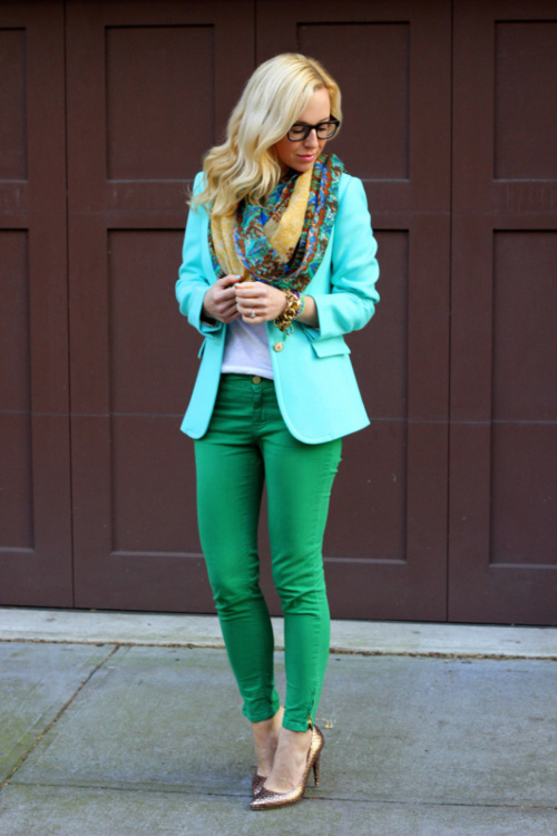
2. Harmonious combinations of related colors are achieved through the use of three colors adjacent to the color wheel. Due to the proximity of the location, these colors can be easily combined. This harmony can have a lot of depth, rich personality and elegant look. The harmony of related colors is based on the similarity of color tones (or on their slight contrast in color tone) and evokes a sense of balance and calmness.

Harmony of related colors
The introduction of a small amount of white or black into combinations of related colors leads to harmony, enhances the emotional expressiveness of the composition. Active light contrast is inherent in the harmonies of related colors, contributing to the expressiveness of tonal combinations. For example, equally saturated three color tones of the same lightness do not form subtle color combinations. As soon as black or white is added to two of the three matching colors, the color combinations become consistent.

Harmony of related colors in nature
3. Harmonious combinations of contrasting colors are created by using two colors that are opposite each other in a color wheel. This technique is usually used to create accents, as the combinations of these color pairs have the greatest color contrast, causing active sound, tension and dynamics of the composition. This allows one color to complement another in such a way that one of them attracts attention and the other is the background.
Harmony of contrasting colors
Starting to create contrasting harmonic combinations, first select the original color, then determine the corresponding contrasting color. By creating a harmony of contrasting colors, you can add achromatic colors to each of the combined colors.
Harmony of contrasting colors. Square
"Square" - a variety of harmonic combinations of contrasting colors of four colors, equidistant from each other.
Harmony of contrasting colors. Tetrad
"Tetrad" - a variety of harmonious combinations of contrasting colors of four colors, in which there are two pairs of colors located opposite each other.

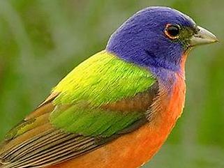
Harmony of contrasting colors in nature
4. Harmonious combinations of related-contrasting colors Is the most common type of color harmony, forming an isosceles triangle in the color wheel. Here harmony is achieved through the use of any color and colors adjacent to its complementary. These colors are softer than a combination of just two complementary colors.
Harmony of related contrasting colors
A characteristic feature of drawing up harmonious combinations of related-contrasting colors is the presence in the combinations of the same amount of the main and contrasting colors.

Harmony of related contrasting colors in nature
5... Harmonic combinations "Triad" - a combination of three colors, equidistant from each other and forming an equilateral triangle in the color wheel. This scheme is popular with artists because it offers strong visual contrast while maintaining balance and color saturation. This composition looks quite lively even when used with pale and desaturated colors.
Harmonic combinations "Triad" show very distinct and strong color combinations, being, however, the most difficult from the point of view of correct creation. To achieve harmony in the triad, one color is taken as the main one, and the other two are used for accents.